Buttons
Design the default button: shape, colors, padding and hover effects.
The button style in the Design System is the default look of every button on your site: the Button widget, buttons inside other widgets such as the Call to Action or Price Table, and form submit buttons. Set it once and your buttons match everywhere.
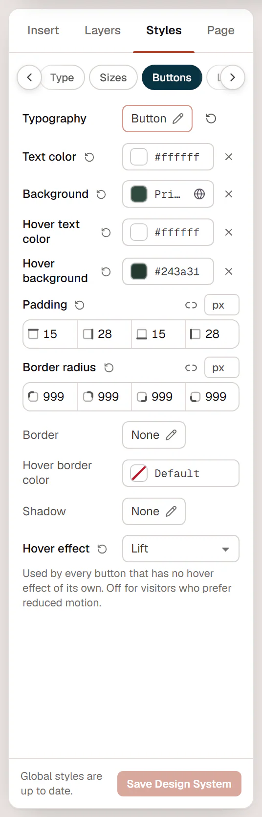
Change the button style
- In the editor, click Styles in the left panel, then the Buttons tab.
- Change the settings. Buttons on the canvas update as you go.
- Click Save Design System.
| Setting | What it does |
|---|---|
| Typography | Font, size, weight and letter spacing of the label. By default it uses the Button text style. |
| Text color / Background | Colors of the button. The background uses your Primary color by default. |
| Hover text color / Hover background | Colors when the pointer is over the button or it has keyboard focus. |
| Padding | Space inside the button, around the label. Can differ per device. |
| Border radius | Rounded corners. Use a large value such as 999 for pill-shaped buttons. |
| Border | Style, width and color of a border. |
| Hover border color | Border color on hover. |
| Shadow | A box shadow under the button. |
| Hover effect | An animation on hover: None, Lift, Grow, Shrink, Pulse, Shine, Nudge icon, Fill from left, Underline or Text roll. |
The hover effect is used by every button that has no hover effect of its own, and it is turned off for visitors who prefer reduced motion.
Pick colors from Site colors in the color picker, so the buttons follow your palette. See Colors.
Button styles on the page
The Button widget has a Style setting with five choices:
- Primary: exactly the Design System button.
- Secondary: the same shape, filled with your Secondary color.
- Outline, Ghost and Text link: lighter versions based on your Primary color.
Typography, radius, border and shadow from the Design System apply to all of them; the colors you set here define the Primary button. The widget's Size (S, M, L, XL) changes the padding.
To change one button only, use the Button widget's own Design settings. Its values override the Design System for that button. See Button.
Want two or three reusable button looks, for example a large call-to-action button? Style one button, then save its look as a class and apply the class to the others.
See all buttons at once
The Style book shows the Primary, Secondary, Outline and Ghost buttons next to each other, with your Design System applied.