Containers & flexbox
Build rows and columns with containers: direction, alignment, gap and wrapping.
On this page
Containers are the boxes that hold your layout. Every section of a page is a container, and so is every row, column and card inside it. A container arranges what is inside it either in a line (flexbox, the default) or in a grid. This page covers the flexbox settings; see Grid for grids.
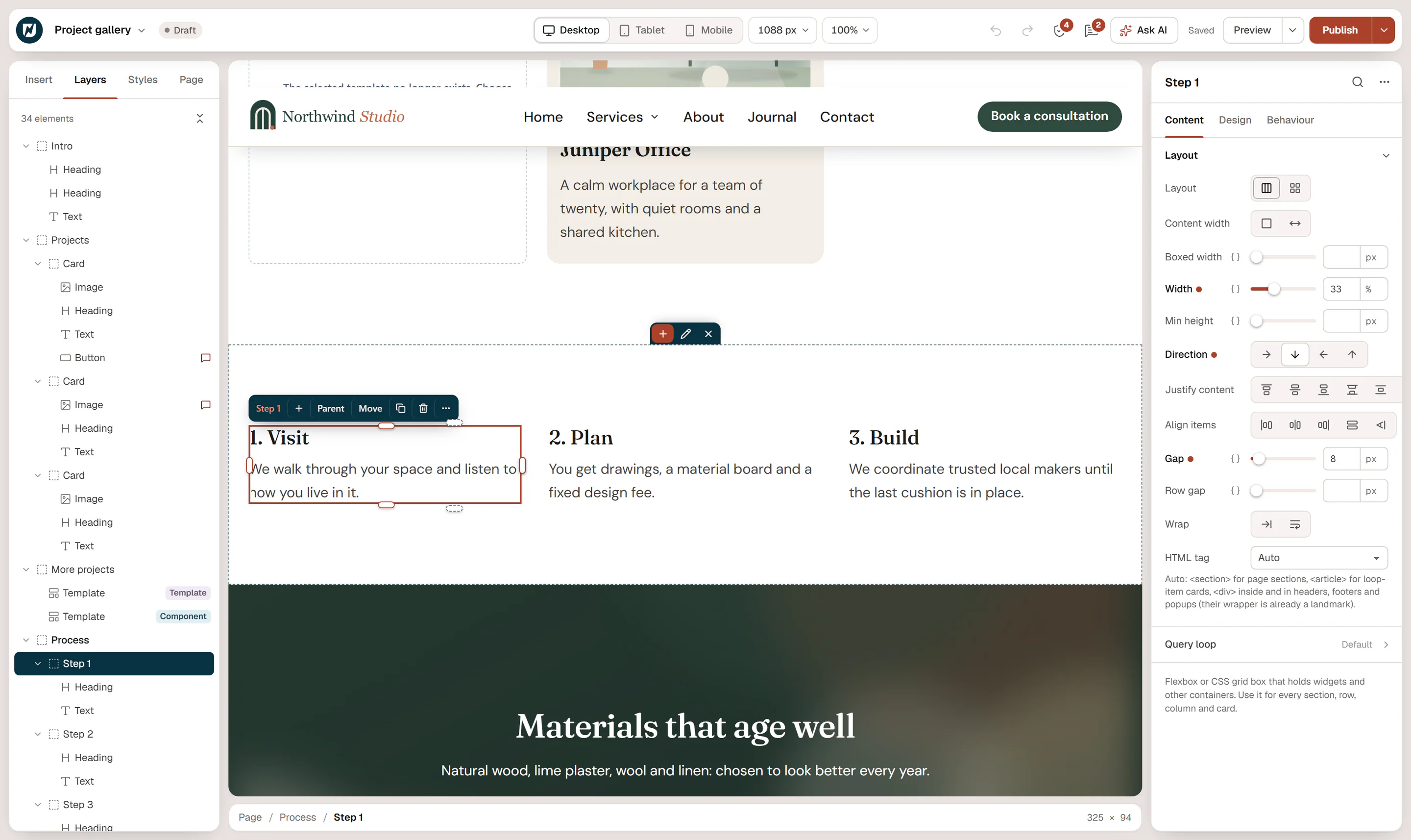
How containers nest
A typical section looks like this in Layers:
- Section (container, column): the full-width band with the background.
- Heading and Text: stacked on top of each other.
- Row (container, row): places its children side by side.
- Column (container, column) with an image.
- Column (container, column) with text and a button.
Top-level containers are your page sections. Containers inside them are rows, columns and cards. Use as few levels as you need; each container adds structure to the page.
Add a container
- A new section: click Add section at the bottom of the page, or use a layout in Insert → Sections. Multi-column layouts create a row with columns for you. See Adding elements.
- A container inside another: drag Container from Insert → Elements (the Layout group).
- Around existing elements: select them and press Ctrl+G (Wrap in container).
Layout settings
Select the container and open Content → Layout.
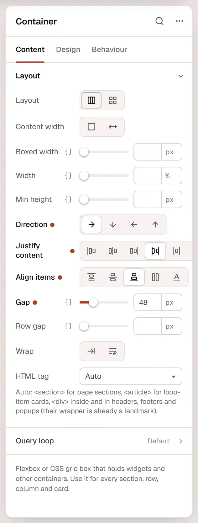
| Setting | What it does |
|---|---|
| Layout | Flexbox (items in a line) or Grid (items in rows and columns). |
| Content width | Boxed or Full width. See Full-width & boxed sections. |
| Width | The width of the container itself, for example 50% for a column in a row. |
| Min height | The minimum height, for example 100vh for a full-screen hero. |
| Direction | Row (side by side), Column (stacked, the default), Row reversed or Column reversed. |
| Justify content | How items are spread along the direction: Start, Center, End, Space between, Space around, Space evenly. |
| Align items | How items line up across the direction: Start, Center, End, Stretch or Baseline. |
| Gap | Space between the items. Empty: the Default gap of your Design System. |
| Row gap | Space between lines when items wrap. |
| Wrap | No wrap keeps all items on one line; Wrap lets them move to the next line when there is no room. |
| Align rows | With Wrap: where the wrapped lines sit when the container is taller than its content: Start, Center, End or Space between. |
| HTML tag | The HTML element: Auto, or div, section, header, footer, main, article, aside, nav, or a (link) to make the whole container a link. |
The icons for Justify content and Align items turn with the direction, so they always show what will happen.
Auto as HTML tag uses <section> for page sections, <article> for loop item cards and <div> elsewhere, which is right in most cases. With a (link), a Link field appears; the whole box becomes clickable, which is handy for cards.
Most layout settings can be different per device: switch to Tablet or Mobile in the top bar and change them there. See Responsive editing.
Build columns
Create a row
Add a Two columns or Three columns layout, or select a container and set Direction to Row.
Set the column widths
Select a column and set its Width, for example 60% and 40%. With spacing handles on, you can also drag the handle on the right edge of a column; it snaps to ¼, ⅓, ½, ⅔ and ¾.
Stack them on phones
Select the row, switch to Mobile in the top bar and set Direction to Column. The layouts from Add section already do this.
Columns without a Width share the row equally. When the row has a Justify content setting, columns without a width take only the space their content needs, so the justify setting can spread them out.
Common layouts
- Center everything in a section: set Align items to Center on a column container, and set Text alignment to center in the container's Design → Text section so headings and paragraphs follow.
- Logo on the left, menu on the right: a row with Justify content: Space between and Align items: Center.
- Buttons side by side: wrap them in a container with Direction: Row and a Gap of 12 px; set Wrap so they move under each other on small screens.
- Equal-height cards: put cards in a row with Align items: Stretch (or use a grid).
Per-element flex settings
The elements inside a flex container have their own settings under Design → Spacing & position: Align self, Order, Grow and Shrink. Use them to push one item to the end, reorder items on mobile, or let one item take the remaining space. See Spacing, size & position.