Price List
A menu-style list of items with prices, joined by a dotted line.
On this page
The Price List widget shows items with their prices, like a café menu or a list of service rates. Each item has a title, a price and an optional description, image and link. A dotted leader line joins the title and the price.
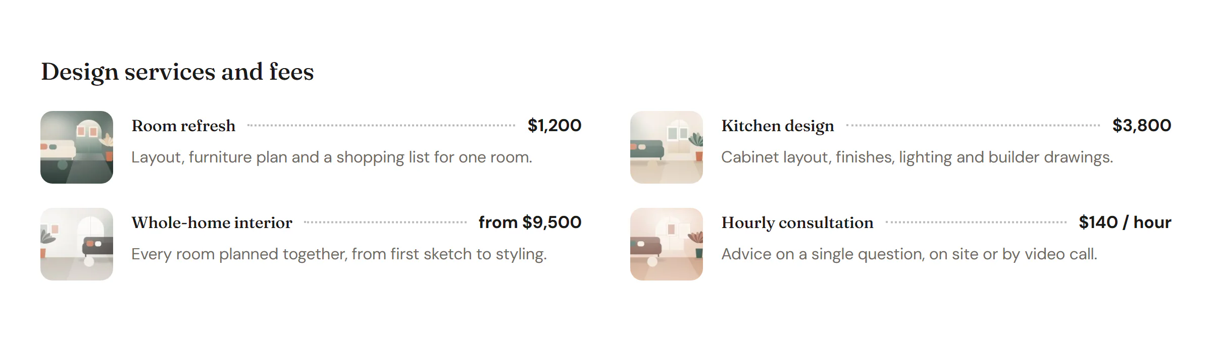
Add a Price List
Open Insert in the left panel and find Price List in the Marketing group, or type "price" in the search box. Drag it onto the canvas, or click it to add it next to the selected element. See Add elements.
Add items
Each item is a row in Items. Click Add item to add one, and drag the handle to reorder. The Price is free text, so include the currency and anything else you need, such as "from $9,500" or "$140 / hour".
Add an Image to an item for a small thumbnail beside it, and a Link to make the item clickable.
Content tab settings
| Setting | What it does |
|---|---|
| Items | The list of items. |
| Title (each item) | The item name. |
| Price (each item) | The price, as free text. Include the currency. |
| Description (each item) | An optional line under the title. |
| Image (each item) | An optional thumbnail. |
| Link (each item) | Makes the item a link. |
| Title HTML tag | H1 to H6, DIV, SPAN or P. Default: H3. |
| Image resolution | Thumbnail, Medium, Medium large, Large or Full. Default: Thumbnail. |
| Setting | What it does |
|---|---|
| Columns | 1 to 4 columns. Can differ per device. |
| Price position | On the title line or Below the title. Default: On the title line. |
| Leader line | The line between title and price: None, Dotted, Dashed or Solid. Default: Dotted. Shown when the price is on the title line. |
| Image position | Left, Right or Top. Default: Left. |
| Dividers between items | Adds a line between items. Off by default. |
Design tab settings
| Section | Settings |
|---|---|
| List | Space between items, Space between columns, Item padding, Item background (with Normal and Hover tabs), Item radius, Divider color (when dividers are on), Image vertical alignment (Top or Center). |
| Image | Width, Aspect ratio (Square, 4:3, 3:2, 16:9, 3:4 or Original), Border radius, Gap to text. |
| Title | Typography, Color, Linked item hover color. |
| Price | Typography, Color, Background (turns the price into a small chip). Leader line: Color, Weight, Space around. |
| Description | Typography, Color, Spacing above. |
The Design tab also has the sections every element shares: Spacing & position, Background & border and Mask. See Spacing, size & position.
Behaviour tab
The Behaviour tab has the settings every element shares: anchor and classes, entrance animations, motion effects, visibility per device, display conditions and interactions. See Motion & effects.
Tips
- For a restaurant menu, add one Price List per course, each under its own heading.
- Set Columns to 1 on phones in the Mobile view so long titles and prices keep enough room.