Colors
Set brand colors once and use them everywhere, so a change updates the whole site.
On this page
Site colors are the palette of your brand. You define them once in the Design System and pick them in any color field. Elements keep a link to the color, so when you adjust a shade later, every heading, button and background that uses it follows.
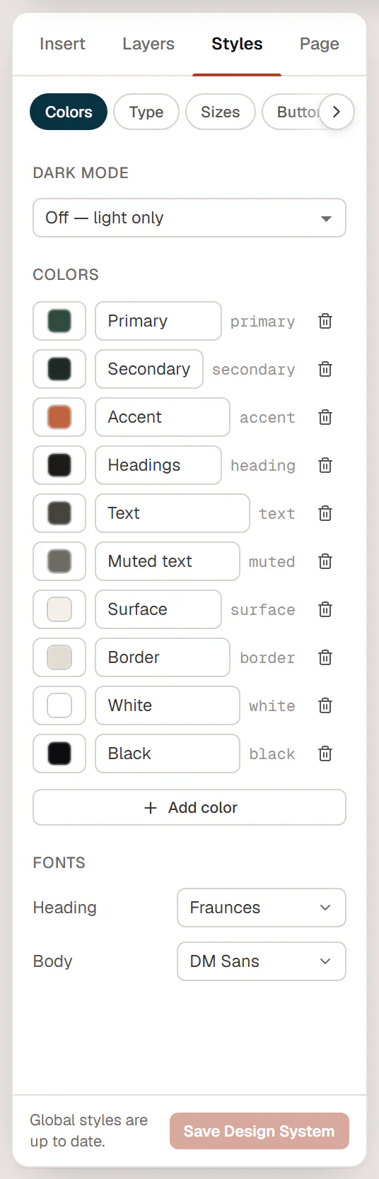
The default colors
Every site starts with ten colors. Their names describe their job; change the values to your brand.
| Color | Typical use |
|---|---|
| Primary | Main brand color: buttons, links, highlights. |
| Secondary | A second brand color, often a dark shade for bands and footers. |
| Accent | Small touches that stand out: badges, eyebrows, icons. |
| Headings | Heading text. |
| Text | Body text. |
| Muted text | Secondary text: captions, meta information, small print. |
| Surface | Light backgrounds for cards and alternating sections. |
| Border | Lines, dividers and field borders. |
| White / Black | Pure white and near-black, for text on dark or light backgrounds. |
Change a color
Open the colors
In the editor, click Styles in the left panel. The Colors tab opens.
Pick the new value
Click the swatch of a color. Choose a shade in the picker, or type any value in the field (hex such as
#2f4a3f,rgb()orhsl()). Use the opacity slider for a transparent color.Save
Click Save Design System. Every element that uses the color updates, on every page.
To rename a color, click its name and type a new one. The short code next to the name, such as primary, is its fixed ID; it never changes, so renaming a color never breaks anything.
Add or delete a color
- Click Add color to add a new color. It starts as Color 1, Color 2… Rename it and pick its value.
- Click the trash icon (Delete …) to remove a color. There is no confirmation, and elements that used the color lose it, so check first. If you delete one by mistake, reload the editor without saving the Design System.
Keep the palette small: a handful of well-named colors is easier to use consistently than dozens of similar shades.
Use site colors on elements
Every color field in the inspector opens a color picker with your colors under Site colors. Click one to use it. The field then shows the color's name with a globe icon, as a reminder that it follows the Design System.
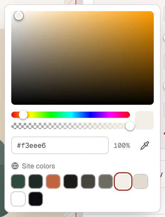
- A color you pick from the square or type in yourself is fixed. It does not change when you update the Design System.
- Recent shows the last colors you typed, in this browser.
- In Chromium-based browsers, the eyedropper (Pick from screen) takes a color from anywhere on your screen.
- The × next to a field clears it, so the element goes back to its default.
Colors in the rest of the Design System
Several defaults use your colors, so they are a good place to start:
- Theme tab: Body text color (Text), Heading color (Headings), Link color (Primary), Link hover color and Page background. See Lightbox & site behaviour.
- Buttons tab: the button background uses Primary. See Buttons.
Colors as CSS variables
Each color is also a CSS variable named after its ID: var(--urmi-c-primary), var(--urmi-c-accent) and so on. Hover the ID in the Colors tab to see it, or click a swatch on Urmi → Design System → Styles to copy it. Your theme's stylesheet or another plugin can use these variables to match your brand colors.
Dark mode
With dark mode on, each color gets a second swatch for its dark value. See Dark mode.