Off-Canvas
A button that opens a panel sliding in from the side, holding any widgets.
On this page
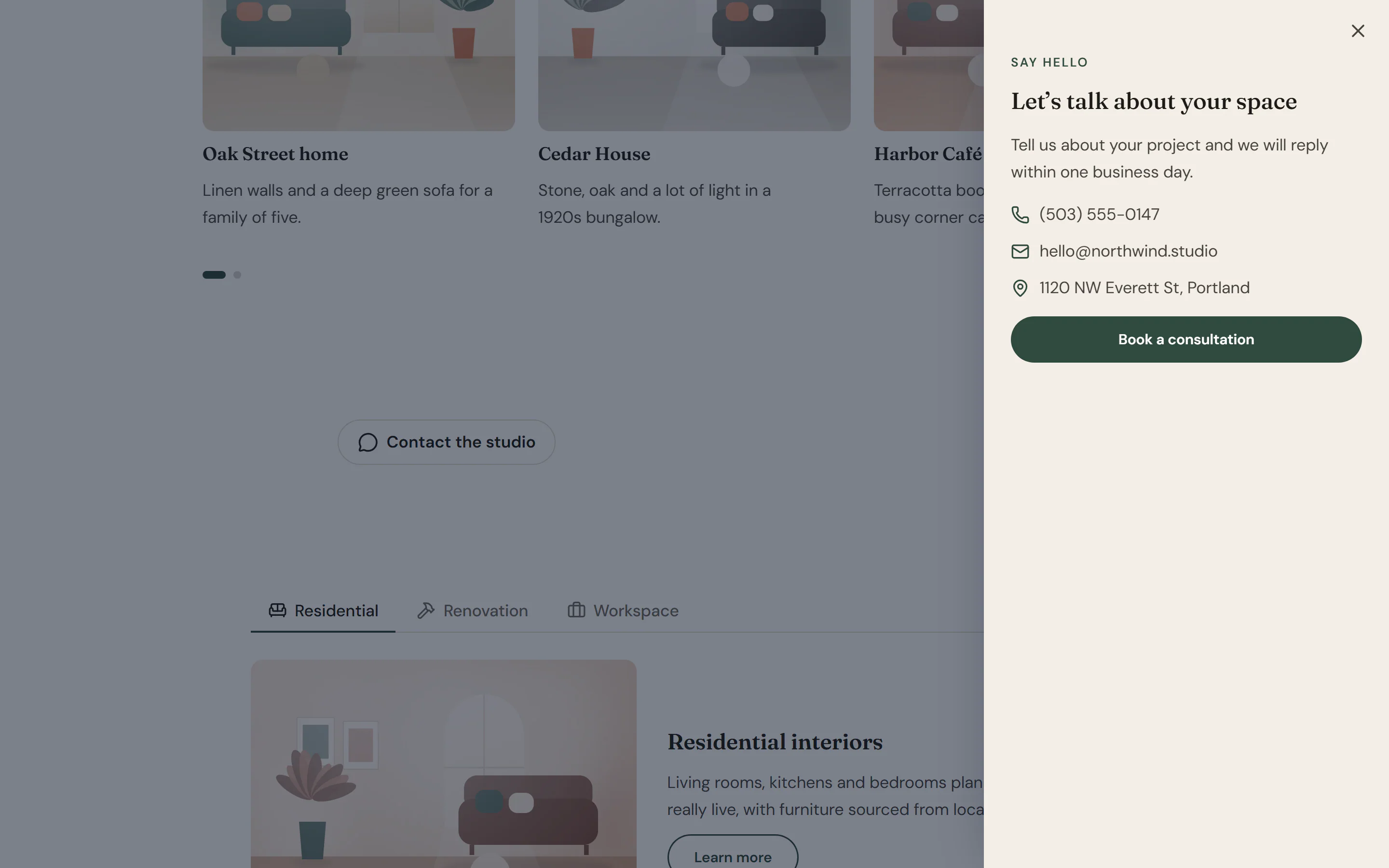
The Off-Canvas widget is a button that opens a panel sliding in from the left, right, top or bottom of the window. The panel is a container, so it can hold a menu, a contact form, filters or anything else you want out of the way until a visitor asks for it. It is often used for a mobile menu or a “Contact us” drawer.
Add an off-canvas panel
Insert it
Open Insert in the left panel, find Off-Canvas under Layout (or type
off-canvasin Search widgets) and click it or drag it onto the canvas.Set up the button
In Content → Trigger, change the Text and Icon. Turn off Show text for an icon-only button (the text is still read by screen readers).
Fill the panel
In the editor the panel shows inline under the button, labelled for example “Off-canvas panel · opens from the right”. Drop widgets into it. On the live page it opens as a sliding panel.
Choose the side and size
In Content → Panel, pick Opens from and set the Width (or Height for top and bottom panels).
Open the panel from any link
Every off-canvas panel has its own link anchor: a link to #urmi-offcanvas- followed by the element ID opens it. For a friendlier address, type a name in Link anchor, such as contact-panel, and link to #contact-panel from a button, a menu item or text. Turn off Show trigger button if the panel should only open from such links.
Settings
Settings marked Per device can differ on desktop, tablet and mobile (see Responsive editing).
Content tab
| Setting | What it does |
|---|---|
| Show trigger button | Shows the button that opens the panel. Turn it off to open the panel only from links. On by default. |
| Text | Text of the trigger button. Shown when Show trigger button is on. |
| Show text | Shows the text next to the icon. When off, only screen readers read it, so an icon-only button still has a name. On by default. Shown when Show trigger button is on. |
| Icon | Icon of the trigger button. Shown when Show trigger button is on. |
| Icon position | Puts the icon before or after the text. Options: Before, After. Default: Before. Shown when Show trigger button is on. |
| Alignment | Aligns the trigger button. Options: Left, Center, Right. Shown when Show trigger button is on. Per device. |
| Setting | What it does |
|---|---|
| Panel | The panel. It is a container on the canvas: drop any widgets into it, such as a menu, a form or contact details. |
| Opens from | The side the panel slides in from. Options: Left, Right, Top, Bottom. Default: Right. |
| Width | Width of a panel that opens from the left or right. Shown when Opens from is Left or Right. Per device. |
| Height | Height of a panel that opens from the top or bottom. Shown when Opens from is Top or Bottom. Per device. |
| Close button | Shows a close button in the panel. Visitors can always close it with the Esc key. On by default. |
| Close icon | Icon of the close button. Shown when Close button is on. |
| Close on overlay click | Closes the panel when the visitor clicks the dimmed page next to it. On by default. |
| Prevent page scrolling | Stops the page behind the panel from scrolling while the panel is open. On by default. |
| Link anchor | A friendlier link anchor. Links to #urmi-offcanvas-{element id} always open the panel; with contact-panel here, links to #contact-panel open it too. |
| Animation (ms) | How long the slide-in takes, in milliseconds. Visitors who prefer reduced motion get no animation. |
| Setting | What it does |
|---|---|
| Accessible name | Name of the panel, announced by screen readers when it opens. |
Design tab
This section shows when Show trigger button is on.
| Setting | What it does |
|---|---|
| Typography | Text style of the trigger button. |
| Normal › Text color | Text and icon color of the trigger button. |
| Normal › Background | Background color of the trigger button. |
| Normal › Border | Border of the trigger button. |
| Hover › Text color | Text and icon color of the trigger button on hover. |
| Hover › Background | Background color of the trigger button on hover. |
| Hover › Border color | Border color of the trigger button on hover. |
| Icon size | Size of the trigger icon. Per device. |
| Icon spacing | Space between the icon and the text. |
| Padding | Space inside the trigger button. Per device. |
| Border radius | Rounds the corners of the trigger button. Per device. |
| Setting | What it does |
|---|---|
| Background | Background of the panel. |
| Text color | Default text color inside the panel. |
| Padding | Space inside the panel. Per device. |
| Border | Border of the panel. |
| Border radius | Rounds the corners of the panel. Per device. |
| Shadow | Shadow of the panel. |
| Setting | What it does |
|---|---|
| Color | Color of the layer that dims the page behind the panel. |
| Background blur | Blurs the page behind the panel. |
This section shows when Close button is on.
| Setting | What it does |
|---|---|
| Size | Size of the close button. |
| Normal › Color | Color of the close icon. |
| Normal › Background | Background color of the close button. |
| Hover › Color | Color of the close icon on hover. |
| Hover › Background | Background color of the close button on hover. |
Every element also has these sections at the end of the Design tab.
| Section | What it does |
|---|---|
| Spacing & position | Margin, padding, width, alignment in its container, order, position (relative, absolute, fixed), offsets, z-index and global classes. See Spacing, size & position. |
| Background & border | Background, border, border radius, box shadow, overflow and opacity of the whole element. See Colors & backgrounds and Borders & shadows. |
| Mask | Crops the element to a shape (circle, arch, blob, star…) or your own SVG or PNG. See Shape dividers & masks. |
Behaviour tab
The Behaviour tab is the same for every element.
| Section | What it does |
|---|---|
| Anchor & classes | An Anchor ID for #links and your own CSS classes. |
| Animations | Entrance, scroll, hover and loop animations from presets or your own timeline. See Motion & effects. |
| Motion & effects | A simple entrance animation, transforms (also on hover), CSS and backdrop filters, and sticky positioning. |
| Scroll & mouse effects | Movement, rotation, scale, fade and blur while the page scrolls, and pointer effects (follow the pointer, 3D tilt). |
| Visibility | Hide the element on desktop, tablet or mobile, or in dark or light mode. See Visibility. |
| Conditions | Show the element only when rules match, such as logged-in visitors, a date range or a URL parameter. See Display conditions. |
| Interactions | Show, hide or change other elements when this one is clicked, hovered or scrolled into view. See Interactions. |
| Attributes | Custom HTML attributes for this element. See Anchor, classes & attributes. |
Tips
- Accessible dialog. The panel opens as a modal dialog: keyboard focus stays inside it, and visitors close it with the Esc key, the close button or a click on the dimmed page. Give the panel a clear Accessible name in Panel.
- Mobile menu. Put a Nav Menu in the panel and hide the widget on desktop with Behaviour → Visibility.
- Keep the page still. Prevent page scrolling stops the page behind from moving while the panel is open.
- Reduced motion. Visitors who prefer reduced motion see the panel appear without the slide animation.