Top bar
Every button in the editor top bar: the menu, devices, undo, checks, notes, preview and publish.
On this page
The top bar runs across the top of the editor. On the left you find the menu and the page title, in the middle the device and canvas controls, and on the right undo, checks, notes, AI, the save state, preview and publish.

Shortcuts on this page are for Windows. On a Mac, use ⌘ instead of Ctrl.
The menu
Click the Urmi logo in the top-left corner to open the menu.
| Item | What it does |
|---|---|
| Layers (Ctrl+I) | Opens the Layers tab of the left panel. |
| Styles (Design System) | Opens the Styles tab, where you edit the site-wide Design System. |
| Page settings | Opens the settings of the page you are editing. The name follows the content type: Post settings, Header settings and so on. See Page settings. |
| History | Your undo steps and saved versions. See History, revisions & autosave. |
| Find & replace | Replaces text, links or colors on this page. See Find & replace. |
| Theme Builder | Opens Urmi → Theme Builder in a new browser tab. Only shown to users who can edit the theme. |
| Petrol night (dark) interface | Switches the editor to its dark look. In dark mode the item reads Paper (light) interface. |
| Docked panels | Docks the panels to the window edges instead of floating them over the canvas. |
| Commands & shortcuts (Ctrl+K) | Opens the command palette. |
| Style book | Shows every widget with your Design System applied. See Style book. |
| Preferences… | Opens Editor preferences. |
| Exit to WordPress | Leaves the editor and goes back to the WordPress edit screen (for templates: to the Theme Builder). |
If your role can edit content only, the design items are greyed out.
Page title and status
Click the page title to open a small popover:
- Title: rename the page here. The new title is saved the next time you save.
- The content type and ID, for example Page · #28.
- View page opens the page on your site in a new tab.
- Page settings opens the settings tab.
- Back to WordPress leaves the editor.
The badge next to the title shows the status: Published, Draft, Pending, Private or Scheduled.
Device, canvas width and zoom
The buttons in the middle change what the canvas shows.
- Desktop / Tablet / Mobile switch the device view. Each button shows its device icon; in a narrow window only the icons are shown. Hover a button to see its screen range, for example Tablet (up to 1024px). The device you pick is also the device you edit: a value you change in Tablet view applies to tablets and phones only. See Responsive editing.
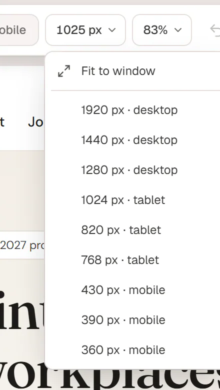
- Canvas width (the chip that shows a width such as 1025 px) sets the exact width of the canvas. Choose Fit to window, or a common screen size: 1920, 1440 or 1280 px for desktops, 1024, 820 or 768 px for tablets, 430, 390 or 360 px for phones. Picking a width also switches to the matching device.
- Zoom scales the canvas to 100% (fit), 75%, 67% or 50%. When your window is narrower than a desktop page, the editor scales the page down so you still see a real desktop layout, and the chip shows the resulting percentage.
Undo and redo
The two arrows undo (Ctrl+Z) and redo (Ctrl+Shift+Z) your last changes. They are greyed out when there is nothing to undo or redo. To jump back several steps at once, open History from the menu. See History, revisions & autosave.
Checks, Notes and Ask AI
- Checks (the shield icon) opens the accessibility checks. A badge shows how many issues there are to review.
- Notes (the speech bubble) opens the notes for this page. A badge shows how many notes are still open.
- Ask AI opens a panel that explains how to connect an AI assistant such as Claude or ChatGPT to your site, with your server address and example requests. See AI & MCP.
Save state
Next to Preview you see whether your work is saved: Saving…, Unsaved changes, or Saved with the time of the last save, for example Saved 2m ago. Unsaved changes to the Design System count too.
While you work, the editor keeps a private backup of unsaved changes every 60 seconds. The backup is used for previews; your live page only changes when you save, publish or update. See History, revisions & autosave.
Preview
- Click Preview to see the page without panels, outlines or handles, right inside the editor. Click Back to editing to return.
- Click the arrow next to it and choose Preview in new tab (Ctrl+P) to open the page in a new browser tab. If you have unsaved changes, the new tab shows them to you only; visitors still see the saved version. Unsaved changes to the title, the page settings and the Design System are not included in this preview.
Publish, Update or Submit
The main button on the right changes with the page status and your role:
| Label | When you see it | What it does |
|---|---|---|
| Publish | The page is not published yet. | Saves and publishes the page. |
| Update | The page is published. | Saves your changes to the live page. Greyed out when there is nothing to update. |
| Submit | Your role cannot publish. | Saves the page and sends it for review. |
Click the arrow next to it for more options:
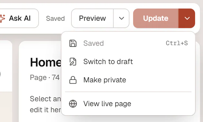
- Save draft (Ctrl+S) saves your changes and keeps the current status. On a published page, the changes go live. When everything is saved, the item reads Saved.
- Switch to draft saves and takes the page offline as a draft.
- Make private makes the page visible only to logged-in editors and administrators. On a private page the item reads Make public.
- Display conditions… appears for Theme Builder templates such as headers, footers and popups. It sets where the template appears. See Display conditions.
- View live page opens the published page in a new tab.
When you publish a header, footer or other template for the first time and it has no display conditions yet, the editor asks Where should this header appear? Choose the pages, or click Later.
In narrow browser windows the top bar gets more compact: the save state is hidden below 1360 px, and below 1180 px the status badge is hidden and Ask AI shows as an icon only.