Steps
A numbered “how it works” process with markers joined by a connecting line.
On this page
The Steps widget explains a process in a few stages, such as "how it works" or "what happens after you book". Each step has a numbered (or icon) marker, a title and a short text, and a line connects the markers. Steps run side by side, and stack on phones.
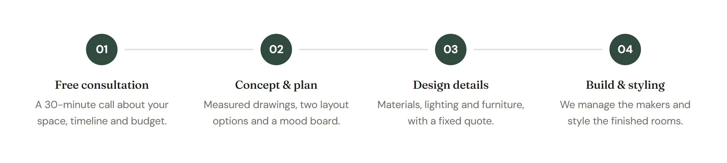
Add Steps
Open Insert in the left panel and find Steps in the Content group, or type "steps" in the search box. Drag it onto the canvas, or click it to add it next to the selected element. See Add elements.
Each step is a row in Steps. Click Add item to add one and drag the handle to reorder. Three to five steps read best side by side.
Choose the layout and markers
- Direction: Horizontal puts the steps in a row; Vertical stacks them with the line running down the side. A horizontal layout stacks by itself below the width you choose in Stack vertically on.
- Marker: Number shows 1, 2, 3 (or 01, 02, 03, A, B, C, I, II, III with Numbering). Icon shows each step's own icon.
- Turn Connector line off for separate markers without a line.
Content tab settings
| Setting | What it does |
|---|---|
| Steps | The list of steps. |
| Title (each item) | The step name. |
| Description (each item) | A short explanation. |
| Icon (each item) | Used when Marker is Icon. |
| Title HTML tag | H1 to H6, DIV, SPAN or P. Default: H3. |
| Setting | What it does |
|---|---|
| Direction | Horizontal or Vertical. Default: Horizontal. |
| Stack vertically on | Phones (below 768px), Tablets and phones (below 1025px) or Never. Default: Phones. Shown for Horizontal. |
| Alignment | Left or Center. Can differ per device. Shown for Horizontal. |
| Marker | Number or Icon. Default: Number. |
| Numbering | 1, 2, 3, 01, 02, 03, A, B, C or I, II, III. Default: 1, 2, 3. Shown for Number. |
| Connector line | Joins the markers with a line. On by default. |
Design tab settings
| Section | Settings |
|---|---|
| Spacing | Space between steps, Space between marker and text. |
| Marker | Size, Background and Number / icon color (with Normal and Hover tabs), Border, Border radius, Shadow, Number typography (for numbers), Icon size (for icons). |
| Connector | Color, Thickness, Style (Solid, Dashed or Dotted), Gap to marker. Shown when Connector line is on. |
| Text | Title typography, Title color, Title spacing, Description typography, Description color, Text max width. |
The Design tab also has the sections every element shares: Spacing & position, Background & border and Mask. See Spacing, size & position.
Behaviour tab
The Behaviour tab has the settings every element shares: anchor and classes, entrance animations, motion effects, visibility per device, display conditions and interactions. See Motion & effects.
Tips
- Start each title with a verb or a clear noun ("Free consultation", "Plan", "Build"), so visitors can scan the process in seconds.
- For a history with dates, use the Timeline widget instead.