Form widget & fields
Add a form, choose field types, labels, validation and layout.
The Form widget builds contact forms, quote requests, booking enquiries and newsletter signups right in the editor. You choose the fields, their labels and layout; Urmi checks every answer on the server, saves the submission, emails you and can pass it on to other services. Spam protection is built in.
Add a form
Add the widget
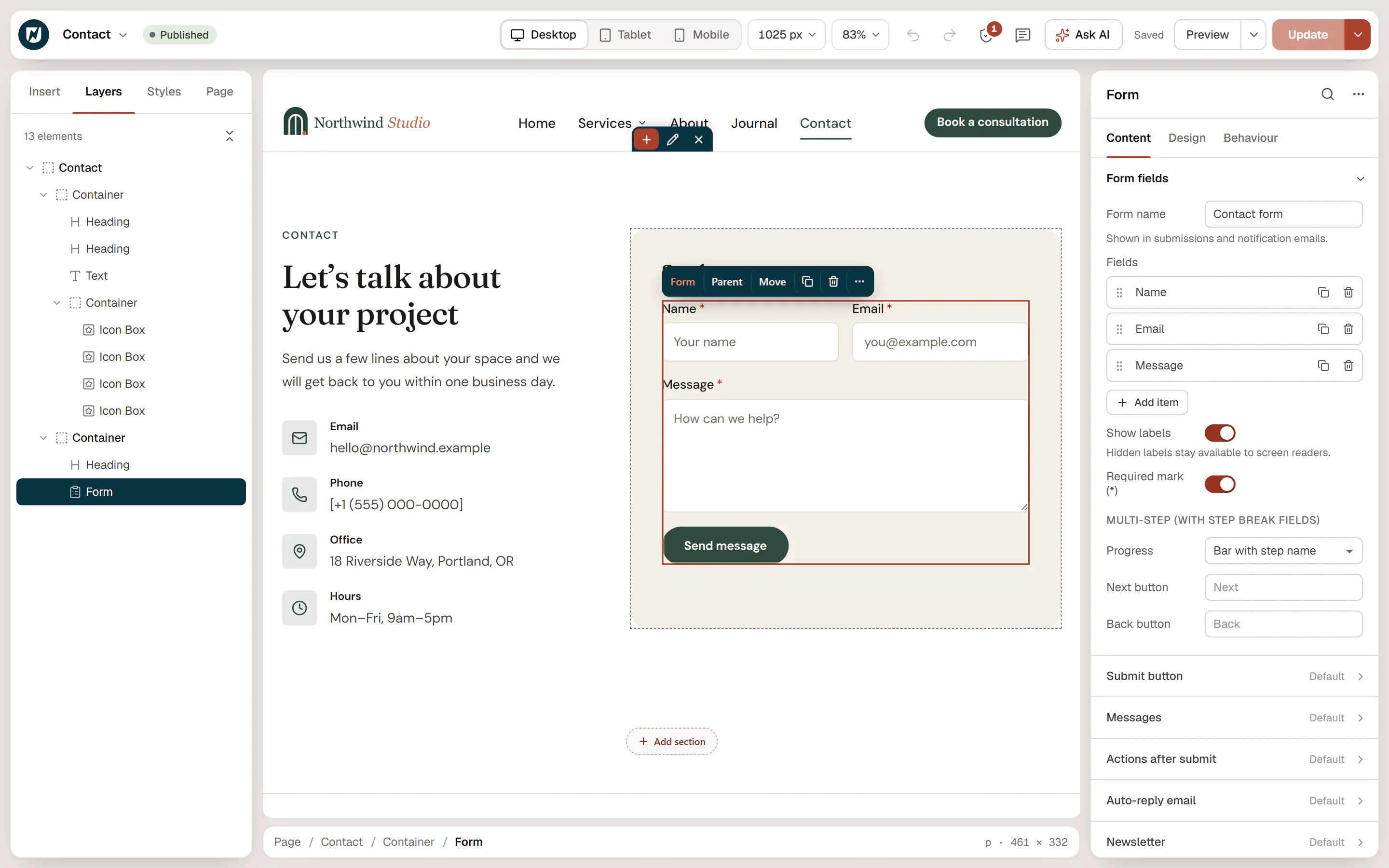
In the editor, open Insert, search for "form" and drag Form onto the page. It starts with three fields: Name, Email and Message.
Name the form
In Content → Form fields, set the Form name, for example "Contact form" or "Quote request". It is shown in Submissions and in notification emails.
Change the fields
Click a field in the Fields list to open its settings, drag the handle to reorder, and use the copy and trash icons to duplicate or delete it. Add item adds a new field.
Choose what happens after sending
Open Actions after submit to set who gets the email and other actions. See Actions after submit.
Publish the page
Forms only accept submissions on published pages and templates.
Field types
| Type | Use it for |
|---|---|
| Text | Short answers: a name, a company. |
| An email address; checked to be a valid address. | |
| Phone | A phone number; checked to be a plausible number. |
| URL | A web address; checked to be a valid address. |
| Number | A number, with optional Minimum and Maximum. |
| Textarea | Longer messages. Rows sets its height (4 by default). |
| Select | A dropdown list of Options. |
| Radio buttons | One choice among a few Options. |
| Checkboxes | Several choices among Options. |
| Acceptance (consent) | A single checkbox such as "I agree to the privacy policy", with Consent text that may contain links. |
| Date | A date picked from the browser's calendar. |
| Hidden | A value sent with every submission without being shown, such as the campaign name (set it in Default value). |
| File upload | Lets visitors attach a file, such as a floor plan or a photo. Needs Allow file uploads in Spam protection. |
| — Step break — | Not a field: starts the next step of a multi-step form. |
Answers are limited to 5,000 characters each.
Field settings
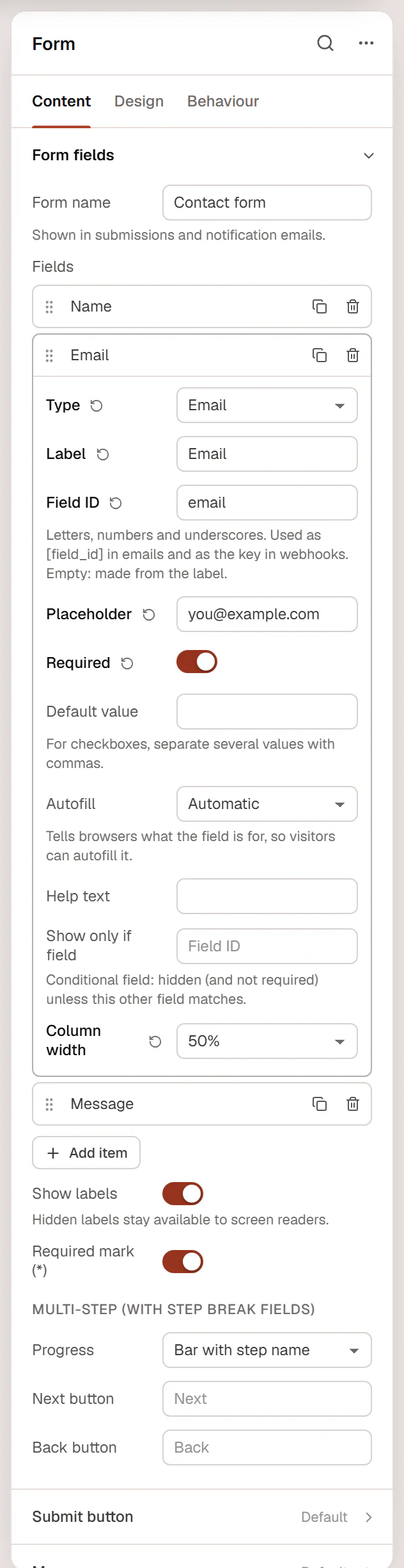
| Setting | What it does |
|---|---|
| Type | The field type (see above). |
| Label | The field's name shown to visitors. |
| Field ID | A short name without spaces, such as email or project_type. It is used in email templates as [field_id] and as the key sent to webhooks. Empty: made from the label. |
| Placeholder | Hint text shown inside an empty field. |
| Required | The form cannot be sent without this field. |
| Options | For Select, Radio buttons and Checkboxes: one option per line. Write Label|value to store a different value, for example Full renovation|renovation. |
| Options side by side | Radio buttons and checkboxes in a row instead of a column. |
| Consent text | For Acceptance: the text next to the checkbox. Links are allowed. Empty: the label. |
| Default value | A value filled in when the form loads. For checkboxes, separate several values with commas. |
| Minimum / Maximum | For Number fields. |
| Rows | Height of a Textarea (2 to 30). |
| Allowed file types | For File upload: extensions separated by commas (pdf,jpg,jpeg,png by default). Only types WordPress accepts are allowed; scripts and SVG never are. |
| Max file size (MB) | For File upload: 1 to 20 MB (2 by default). |
| Autofill | Tells browsers what the field is for (Full name, Email, Phone, Company, Street address…), so visitors can fill it in with one tap. |
| Help text | A short explanation under the field. |
| Show only if field | Makes the field conditional: type the Field ID of another field, a Condition (is, is not, contains, is filled in, is empty) and a Value. The field stays hidden, and is not required, until the other field matches. |
| Column width | 100 %, 75 %, 66 %, 50 %, 33 % or 25 % of the form's width. It can differ per device: switch the device in the inspector. |
For example, add a Text field "Company name" with Show only if field client_type is business, next to a Radio buttons field client_type with the options "Private|private" and "Business|business".
Form settings
| Setting | What it does |
|---|---|
| Form name | Shown in submissions and notification emails. |
| Show labels | Hide the labels for a compact form. Hidden labels stay available to screen readers. |
| Required mark (*) | Shows an asterisk after the labels of required fields. |
| Progress / Next button / Back button | For multi-step forms. See Multi-step forms. |
| Setting | What it does |
|---|---|
| Text | The button label ("Send message" by default). |
| Icon / Icon position | An optional icon before or after the text. |
| Style | Primary, Secondary, Outline or Ghost, from your button styles. |
| Size | S, M, L or XL. |
| Column width | Width of the button's column, like a field. |
| Alignment | Left, Center, Right or Full width. |
| Setting | What it does |
|---|---|
| Success message | Shown after a successful submission (unless you redirect visitors). |
| Error message | Shown when the submission could not be sent. |
| Required field message | Shown under empty required fields ("This field is required." by default). |
The Design tab styles the gaps between fields, the labels, the fields (colors, border, focus color, radius, padding, checkbox and radio color), the button (normal and hover) and the messages.
What visitors see
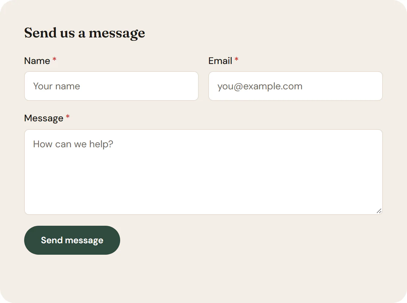
- Each field is checked when the visitor leaves it, and everything is checked again on the server. Invalid fields are highlighted with a message, and the first one gets the focus.
- After sending, the form is cleared and the Success message appears. With Redirect after success, the visitor is taken to that page a moment later.
- The form works without JavaScript too: the page reloads and shows the result.