Motion & effects
Entrance animations, transforms, filters, sticky elements, scroll and mouse effects.
On this page
Motion draws attention and makes a page feel alive: elements that fade in as they scroll into view, cards that lift on hover, a header that sticks to the top, images that drift with the scroll. All of this lives in the Behaviour tab of an element, in three sections: Animations, Motion & effects and Scroll & mouse effects.
Every effect respects visitors who prefer reduced motion (a setting in their operating system): for them, animations and scroll effects do not run and the element shows as styled.
Animations
Behaviour → Animations is the most flexible way to animate an element. Each animation has a trigger, one or more steps, and timing.
Add an animation
Open Animations
Select the element and open Behaviour → Animations. Click Add an animation.
Pick a preset
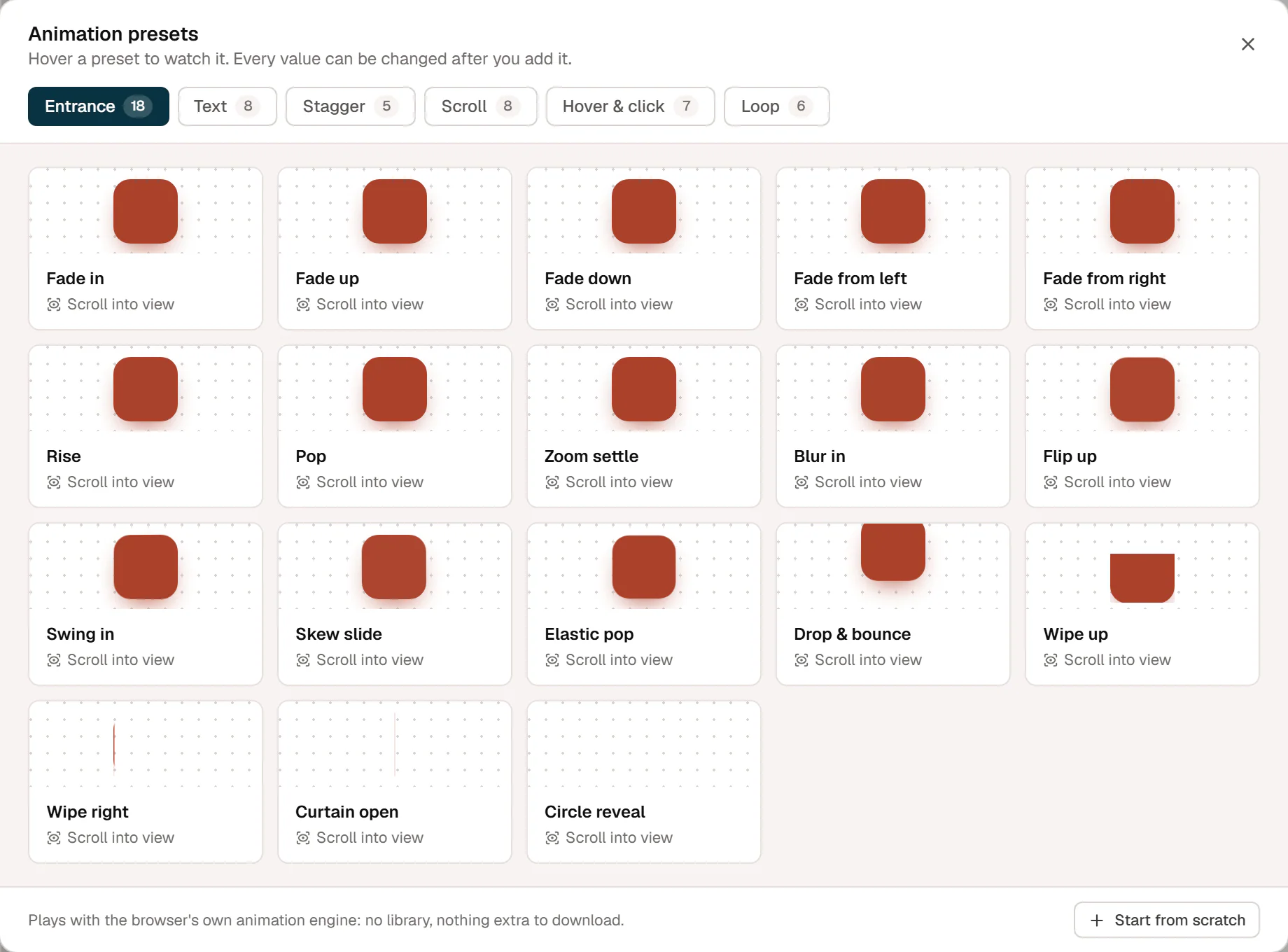
Hover a preset to watch it, then click it. There are more than 50, in six groups:
- Entrance: Fade in, Fade up, Rise, Pop, Zoom settle, Blur in, Flip up, Swing in, Wipe up, Curtain open, Circle reveal and more.
- Text (for headings and text): Words rise, Words from a mask, Lines from a mask, Letters fade, Letters pop, Typewriter and more.
- Stagger (for containers): Cascade up, Pop in turn, From the center, Cards flip, Random fade.
- Scroll: Parallax, Fade & grow in, Wipe reveal, Zoom through, Rotate, Slide across, Focus in & out, Letters on scroll.
- Hover & click: Lift, Grow, Tilt, Spin, Letters wave, Jelly, Press bounce.
- Loop: Float, Pulse, Sway, Spin, Wiggle, Heartbeat.
Or click Start from scratch for a simple fade-up to build on.
Adjust it
The animation appears as a card. Open it to change the trigger, timing and steps, and click the play button (Preview on the canvas) to see it again.
Triggers
| Trigger | When it plays |
|---|---|
| Scroll into view | When the element comes into view. Replay: Once, Every time it comes into view or Play back when it leaves. Starts at sets how far up the screen the element must be. |
| Page load | As soon as the page opens. |
| Scroll scrub | Follows the scrollbar while the element crosses the screen: scroll down and it plays, scroll up and it rewinds. Range and Catch-up control the details. |
| Hover | On hover or keyboard focus, and back when the pointer leaves. |
| Click | On click. With Toggle, a second click plays it back. |
| Loop | Forever, resting while the element is off screen. |
What is animated
- Animate: The element, Child items, one by one (for a container of cards), or, on text widgets, Words, one by one, Letters, one by one or Lines, one by one. Mask makes each word slide out from behind its own edge.
- Stagger sets the time between one item and the next, and the order: First to last, Last to first, From the center, From the edges or Random.
- Start is where the animation starts, for example opacity 0 and 30 px lower. Leave it empty to start as styled.
- Steps: each step has a duration, an easing (such as Strong out, Back or Elastic, in, out or in-out) and the properties it animates. Click + Property to add Opacity, Move X, Move Y, Scale, Rotate, Skew, Blur or Clip reveal. Click Add step for a sequence.
- Delay, Repeat and Yoyo (play every other repeat backward).
- Runs on: turn the animation off on desktop, tablet or mobile.
An element can have several animations, for example an entrance and a hover effect. The card menu has Duplicate animation and Delete animation. On the canvas, animations play only when you preview them; on the live site they run with the browser's own animation engine, with nothing extra to download.
Motion & effects
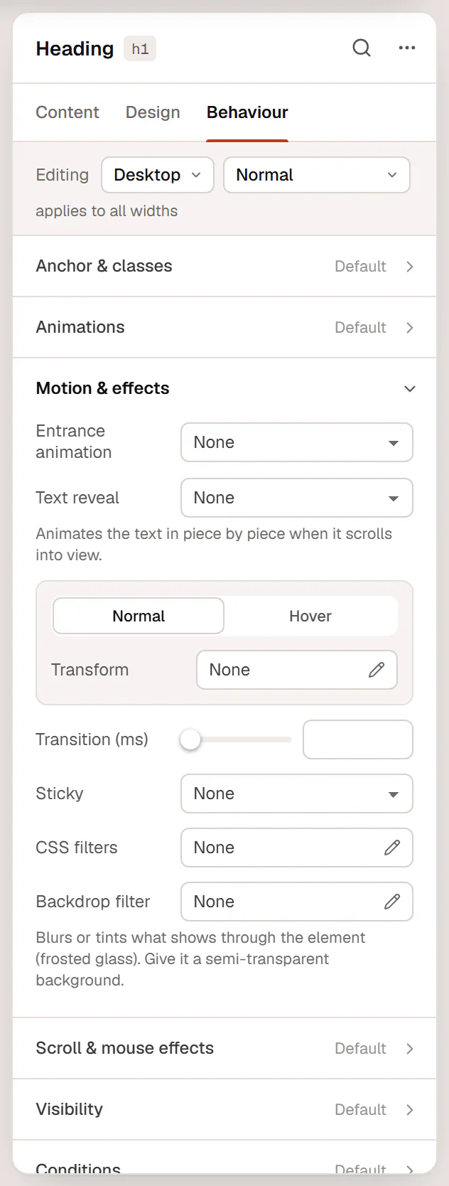
Behaviour → Motion & effects holds simpler effects.
Entrance animation
A quick way to fade or slide an element in when it scrolls into view: choose Entrance animation (Fade in, Fade up, Fade down, Fade from left, Fade from right, Zoom in, Zoom out, Slide up, Slide down, Slide from left, Slide from right, Flip up or Blur in) and set Duration (ms) and Delay (ms). For more control, use Animations above.
On headings and text, Text reveal animates the text Word by word, Letter by letter or Line by line as it scrolls into view, with a Reveal effect (Fade up, Fade, Blur in, Slide up from a mask, Flip up), Stagger (ms), Reveal duration (ms) and Reveal delay (ms).
Transform and transform on hover
The Normal tab has Transform, the Hover tab Transform on hover. Each can move (Offset X, Offset Y), Rotate, Scale and skew (Skew X, Skew Y) the element. For example, a card that rises on hover: Transform on hover → Offset Y −6 px.
Transition (ms) makes the change between normal and hover smooth, for transforms and also for colors, backgrounds, shadows and borders. 200 to 300 ms feels natural.
Make an element sticky
Sticky keeps an element in view while the page scrolls, within its parent container:
- Set Sticky to Top (or Bottom).
- Set Sticky offset (px), the distance from the top of the window, for example 100 px to stay below a sticky header.
- In Sticky on, keep the devices where it should stick. Elsewhere it scrolls with the page.
A sticky element sticks only while its parent container is on screen. A typical use is a sidebar column next to a long text. For a sticky site header, use the header's own setting instead; see Page settings.
Filters
- CSS filters: Blur, Brightness, Contrast, Saturate, Grayscale and Hue, for example a grayscale logo.
- Backdrop filter: blurs or tints what shows through the element, for the frosted-glass look. Give the element a semi-transparent background for it to show.
Scroll & mouse effects
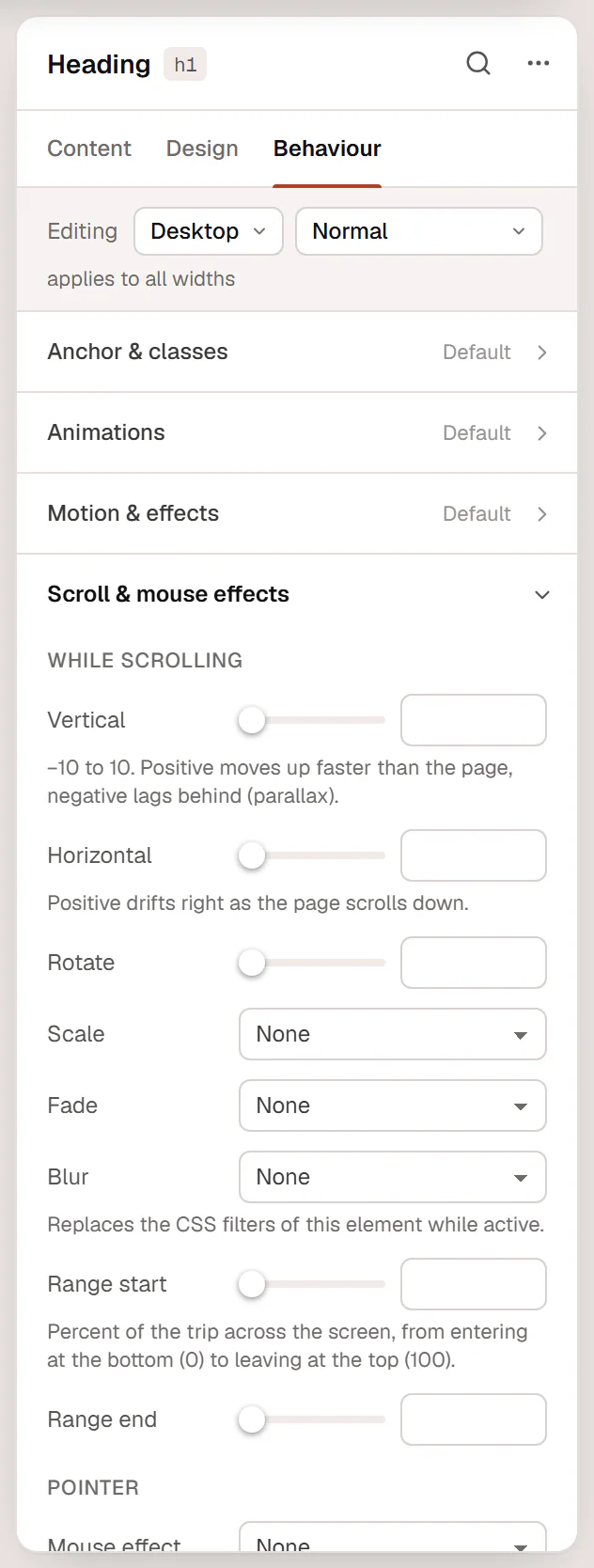
Behaviour → Scroll & mouse effects moves elements with the scroll or the mouse pointer on the live site.
While scrolling
| Setting | What it does |
|---|---|
| Vertical | −10 to 10. Positive moves up faster than the page, negative lags behind (parallax). |
| Horizontal | Positive drifts right as the page scrolls down. |
| Rotate | Turns the element as the page scrolls. |
| Scale | Grow into place, Shrink as it leaves, Grow in, shrink out, Grow while scrolling or Shrink while scrolling, with Amount (%). |
| Fade / Blur | In (as it enters), Out (as it leaves) or In and out. |
| Range start / Range end | The part of the element's trip across the screen where the effect runs, from 0 (entering at the bottom) to 100 (leaving at the top). |
Pointer
- Mouse effect: Follow the pointer (the element drifts with the mouse) or 3D tilt on hover, with Strength. Works on devices with a mouse.
- Apply on: the devices where the effects run. Empty means every device.
These effects do not run in the editor. Preview the page to see them.
Keep it tasteful
- Animate a few important things, not everything. One entrance per section is usually enough.
- Keep durations short: 300 to 800 ms for entrances, under 300 ms for hover.
- Avoid animating large text blocks word by word; it slows down reading.