Layout & appearance
Modal, slide-in, bar or full screen: position, size, animation, overlay and closing.
A popup's layout decides its shape and place on the screen: a centered modal, a small panel in a corner, a bar along the top or bottom, or a full-screen takeover. You also set its size, colors, entrance animation, the dimmed overlay behind it and how visitors close it.
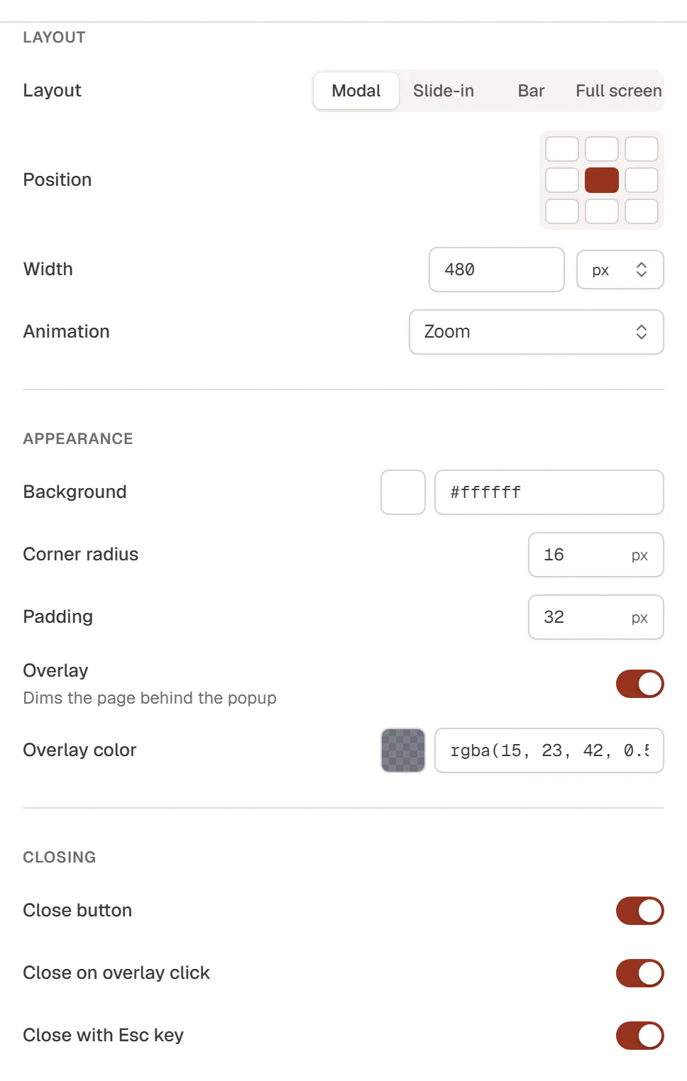
These settings are in the Theme Builder's Popup settings drawer and in the Popup tab of the editor (under Appearance and Closing). Both change the same popup.
Choose a layout
| Layout | Use it for |
|---|---|
| Modal | A box in the middle of the screen (or at another Position) that asks for attention: a signup, an offer, a confirmation. |
| Slide-in | A smaller panel in a corner or at a side, for example a chat prompt or a discreet offer. Pair it with Overlay off so visitors can keep reading. |
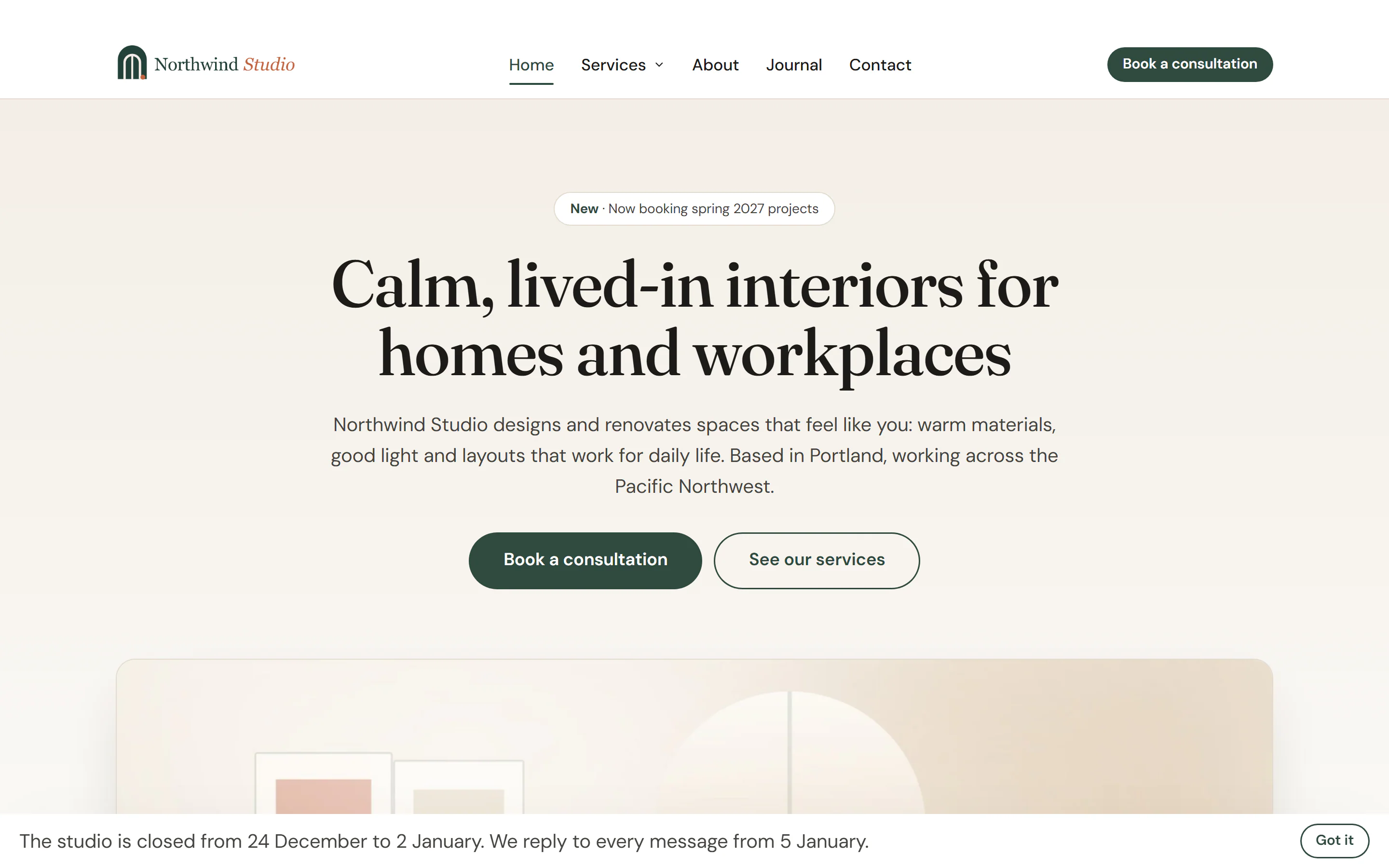
| Bar | A full-width strip along the top or bottom of the window, for announcements such as holiday opening hours. |
| Full screen | Covers the whole window, for an important announcement or a focused signup. It has no position or width. |
Position, size and animation
| Setting | What it does |
|---|---|
| Position | Where the popup sits: the nine cells of the grid (top left to bottom right). Bars use top or bottom. Not used by Full screen. |
| Width | In px, %, vw or rem (560 px by default). Popups never get wider than the screen. Not used by Full screen. |
| Animation | How it appears: Zoom (default), Fade, Slide up, Slide down, Slide left, Slide right or None. Visitors who prefer reduced motion always see it without animation. |
In the editor's Popup tab the slide animations read Slide from the right and Slide from the left.
Appearance
| Setting | What it does |
|---|---|
| Background | Background color of the popup (white by default). |
| Corner radius | Rounded corners, in pixels (16 by default). |
| Padding | Space inside the popup, in pixels (32 by default). Bars use half of it at the top and bottom. |
| Overlay | Dims the page behind the popup. With an overlay, the page cannot scroll and keyboard focus stays inside the popup until it closes. |
| Overlay color | Color and transparency of the overlay. |
The content inside the popup (text, images, form) is styled like any other element in the editor. Set the popup's own background to transparent if your content has its own background and shape.
Closing
| Setting | What it does |
|---|---|
| Close button | A round × button in the top right corner. |
| Close on overlay click | Clicking the dimmed page closes the popup. Only with Overlay on. |
| Close with Esc key | Esc closes the popup. |
You can also add your own close button inside the popup: give any button or link the address #urmi-popup:close. See Open from a link. If you turn off every way of closing, make sure the popup's content has such a button.