Logo Grid
Client or partner logos as a grid or a scrolling marquee.
The Logo Grid shows client, partner or press logos, either as a tidy grid with optional divider lines or as an endless scrolling marquee. Logos are gray until the pointer is over them, so they sit quietly on the page and still look like themselves on hover.
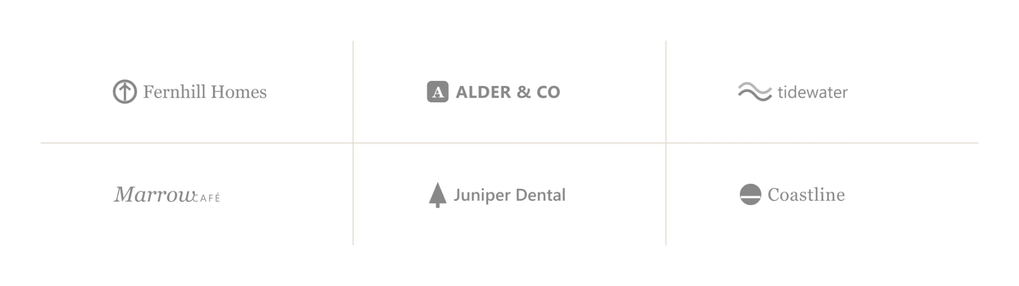
Add a logo grid
Insert it
Open Insert in the left panel, find Logo Grid under Media (or type
logoin Search widgets) and click it or drag it onto the canvas.Choose the logos
Click Add images in Content → Logos and select the logo files. SVG or transparent PNG files look best.
Pick grid or marquee
Keep Grid and set the Columns and Divider lines, or choose Marquee for a scrolling line and set its Loop duration (seconds) and Direction.
Size the logos
On the Design tab, set Logo max height so logos of different shapes look balanced.
Settings
Settings marked Per device can differ on desktop, tablet and mobile (see Responsive editing).
Content tab
| Setting | What it does |
|---|---|
| Logos | The logo images. Add images opens the media library; Move left and Move right change the order. The alt text (or the title) of each image names the logo for screen readers. |
| Display | Grid shows the logos in rows and columns; Marquee scrolls them endlessly in one line. Options: Grid, Marquee. Default: Grid. |
| Columns | Number of columns in the grid. Shown when Display is Grid. Per device. |
| Divider lines | Draws lines between the logos. Shown when Display is Grid. |
| Loop duration (seconds) | Seconds for one full loop of the marquee; lower is faster. Shown when Display is Marquee. |
| Direction | Direction the marquee moves. Options: Left, Right. Default: Left. Shown when Display is Marquee. |
| Pause on hover | Stops the marquee while the pointer is over it. On by default. Shown when Display is Marquee. |
| Fade edges | Fades the logos out at both ends of the marquee. On by default. Shown when Display is Marquee. |
| Resolution | The image size WordPress serves. Logos are small, so Medium is usually enough. Default: Medium. |
Design tab
| Setting | What it does |
|---|---|
| Logo max height | Tallest a logo may be. Per device. |
| Logo max width | Widest a logo may be. Per device. |
| Spacing | Space between the logos. Per device. |
| Cell padding | Space inside each cell. Per device. |
| Grayscale until hovered | Shows the logos in gray until the pointer is over them. On by default. |
| Normal › Opacity | Opacity of the logos, from 0 to 1. |
| Hover › Opacity | Opacity of a logo on hover. |
| Setting | What it does |
|---|---|
| Background | Background color of each cell. |
| Border | Border of each cell. |
| Border radius | Rounds the corners of each cell. Per device. |
| Divider color | Color of the divider lines. Shown when Display is Grid and Divider lines is on. |
| Divider width | Thickness of the divider lines. Shown when Display is Grid and Divider lines is on. |
| Edge fade width | Width of the fade at the ends of the marquee. Shown when Display is Marquee and Fade edges is on. |
Every element also has these sections at the end of the Design tab.
| Section | What it does |
|---|---|
| Spacing & position | Margin, padding, width, alignment in its container, order, position (relative, absolute, fixed), offsets, z-index and global classes. See Spacing, size & position. |
| Background & border | Background, border, border radius, box shadow, overflow and opacity of the whole element. See Colors & backgrounds and Borders & shadows. |
| Mask | Crops the element to a shape (circle, arch, blob, star…) or your own SVG or PNG. See Shape dividers & masks. |
Behaviour tab
The Behaviour tab is the same for every element.
| Section | What it does |
|---|---|
| Anchor & classes | An Anchor ID for #links and your own CSS classes. |
| Animations | Entrance, scroll, hover and loop animations from presets or your own timeline. See Motion & effects. |
| Motion & effects | A simple entrance animation, transforms (also on hover), CSS and backdrop filters, and sticky positioning. |
| Scroll & mouse effects | Movement, rotation, scale, fade and blur while the page scrolls, and pointer effects (follow the pointer, 3D tilt). |
| Visibility | Hide the element on desktop, tablet or mobile, or in dark or light mode. See Visibility. |
| Conditions | Show the element only when rules match, such as logged-in visitors, a date range or a URL parameter. See Display conditions. |
| Interactions | Show, hide or change other elements when this one is clicked, hovered or scrolled into view. See Interactions. |
| Attributes | Custom HTML attributes for this element. See Anchor, classes & attributes. |
Tips
- Name each logo. Screen readers read each logo's alt text, or its title when the alt text is empty. Use the company name.
- Balance sizes. Wide wordmarks look bigger than square marks at the same height; lower Logo max width for very wide logos.
- Marquee and motion. The marquee pauses on hover with Pause on hover; consider a grid on pages where motion would distract.