Hover & other states
Style hover, focus, pressed, ::before and ::after states, or any custom selector.
On this page
Elements can look different when visitors interact with them: a button that darkens on hover, a card that lifts, a link that shows a clear outline when it has keyboard focus. In Urmi you style these states with the same settings as the normal look, by switching the state at the top of the inspector.
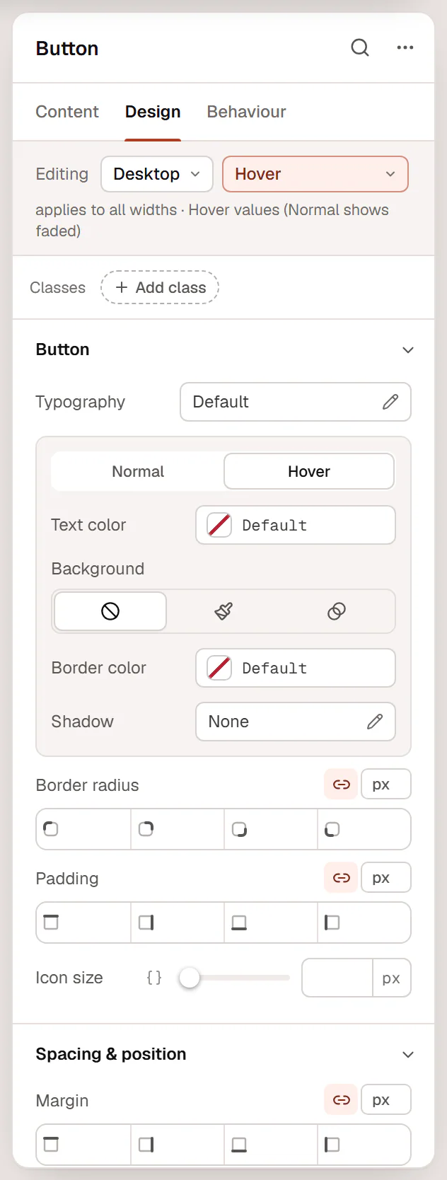
Style a state
Select the element
Select it on the canvas and open the Design (or Behaviour) tab.
Pick the state
In the Editing row at the top, change Normal to Hover, Focus, Pressed, ::before or ::after. The hint below reads, for example, Hover values (Normal shows faded).
Change the settings
The inspector now shows only the settings that can change in that state. Their normal values show faded as a reference. Set the values for the state, for example a darker background.
Go back to Normal
Switch back to Normal when you are done. States you have styled are marked with a dot (•) in the list.
The canvas shows the state you are editing, so you can see the hover look without hovering.
The states
| State | When it applies |
|---|---|
| Normal | Always: the element's normal look. |
| Hover | The pointer is over the element. |
| Focus | The element, or something inside it, has keyboard focus (visitors pressing Tab). Use it to show a clear outline. |
| Pressed | While the element is being clicked or tapped. |
| ::before / ::after | An extra decorative layer before or after the element's content, for example a small line under a heading. Urmi adds the needed empty content for you; give it a size, a background and a position. |
Style Focus whenever you style Hover, so keyboard users get the same visual feedback as mouse users.
Custom selectors
Choose Custom selector… to style the element in another situation, or to style something inside it. Type a selector where & means this element:
| Selector | Styles |
|---|---|
&.is-open | The element when it has the class is-open, for example one added by an interaction. |
& > .icon | The icon directly inside the element. |
&:nth-child(2) | The element when it is the second item in its container. |
.menu-item | Without &, the selector targets elements inside this one. |
Custom selectors you have used appear in the state list, so you can come back to them.
Hover tabs in sections
Some sections have their own Normal and Hover tabs, for example the button colors or a container's Background. They follow the state you pick in the Editing row, and you can also click them directly.
Hover effects without states
For common hover effects you do not need to style a state:
- Buttons have a Hover effect such as Lift, Grow or Shine, and a site-wide default in the Design System.
- Behaviour → Motion & effects → Transform on hover moves, scales or rotates an element on hover. See Motion & effects.
- Behaviour → Animations has hover and click animations. See Motion & effects.
Set Transition (ms) in Motion & effects to make changes between states smooth instead of instant.