Full-width & boxed sections
Control the content width of sections, full-bleed backgrounds and side gutters.
On this page
On a wide screen, text that runs from edge to edge is hard to read. That is why sections in Urmi are boxed by default: the background of the section runs the full width of the screen, while the content stays in a centered box of a comfortable width. You can make any section full width instead, for example for an image band or a full-screen hero.
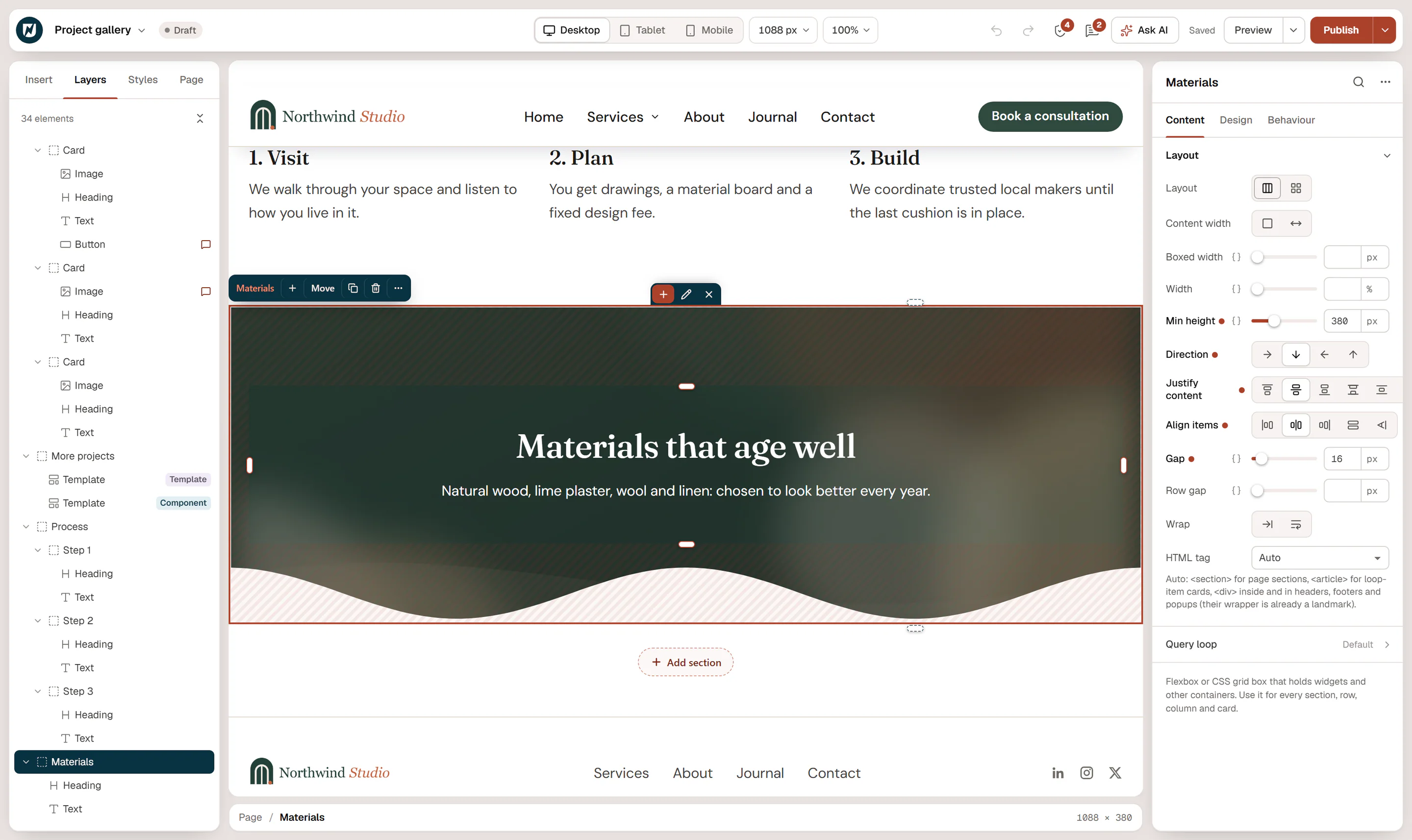
Boxed and full width
Select the section and open Content → Layout → Content width:
| Option | What happens |
|---|---|
| Boxed | The background fills the full width. The content sits in a centered box no wider than Boxed width, with a side gutter so it never touches the screen edge. |
| Full width | The content spans the full width of the container, edge to edge, without a side gutter. |
Top-level sections are boxed unless you change them; containers inside a section are full width, so they fill the box of their section.
The width of the box
By default the box is as wide as the Container width of your Design System (1200 px on a new site), and the side gutter is the Side gutter (24 px, 16 px on phones). Change them once for the whole site in Styles → Layout. See Sizes & layout.
To change it for one section only, set Boxed width on that section, for example 760 px for a narrow text section or 1400 px for a wide gallery. It can differ per device.
Full-bleed backgrounds
The background, overlay and shape dividers of a section always cover its full width, whether it is boxed or not. So for a colored band or a background photo that runs edge to edge, keep the section Boxed: the background is full-bleed, and the text stays readable.
Use Full width when the content itself should reach the edges:
- an image or video that spans the screen;
- a logo strip or marquee that scrolls across the whole width;
- a two-column layout where one half is a photo that touches the screen edge.
With Full width, add your own Padding where text needs space from the screen edge. See Spacing, size & position.
Full width and your theme
Whether a section can reach the edges of the browser also depends on the page template. With Urmi Full Width or Urmi Canvas (no header/footer) (set in Page settings), your sections span the whole window. With Theme default, your theme may place the content in a narrower column.
Headers, footers, popups, mega menus and loop item cards follow the same rules, except that a boxed container in a popup, mega menu or card spans the width of that box.
Space between sections
The space above and below each top-level section comes from Section spacing in Styles → Layout (96 px on desktop by default, less on smaller screens). Set Padding on a section to override it. See Sizes & layout.