Classes
Reuse a style on many elements with classes, and update them all at once.
On this page
A class is a named style you can put on many elements of the same type. Style one card, save its look as a class called "Card", and apply it to every other card. When you later change the class, every element that uses it changes too, on every page.
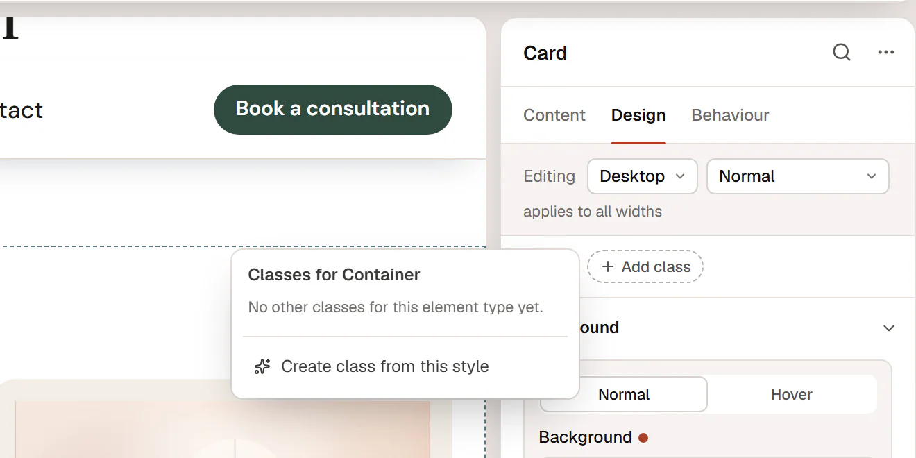
Where classes live
Classes are part of your Design System, so they are shared by the whole site. Each class belongs to one element type: a class made from a Button can be used on buttons, a class made from a Container on containers.
You find the Classes bar at the top of an element's Design tab. It lists the classes on the element and has a button to add one (Add class).
Create a class from an element
Style one element
Select an element and give it the look you want in the Design tab: colors, padding, border, radius, shadow and so on.
Create the class
Click Add class in the Classes bar, then Create class from this style.
Name it
Type a name such as
Card,EyebroworPrimary CTAand click Create.
The element's own style settings move into the class, and the class is applied to the element. It looks the same as before, but now the style is shared. The editor confirms with Class “Card” created.
If the option is greyed out with the hint Style this element first, the element has no style settings of its own yet.
Apply a class
- Select another element of the same type.
- Click Add class (or + if it already has classes).
- Choose the class from the list Classes for ….
An element can have several classes.
Change a class everywhere
Click a class chip in the Classes bar to manage it:
| Option | What it does |
|---|---|
| Update class from this element | Moves this element's own style settings into the class, so every element with the class gets them. |
| Remove from this element | Takes the class off this element only. |
| Rename | Gives the class a new name. |
| Delete class… | Deletes the class. Every element using it loses these styles, on every page, but keeps its own settings. |
For example, to make all cards rounder: select one card, change its Border radius, click the Card chip and choose Update class from this element.
Changes to a class itself (create, update, rename, delete) are saved to the Design System immediately and cannot be undone with Ctrl+Z. Applying or removing a class on an element is a normal page change that you save with the page.
Creating, renaming and deleting classes is part of the Design System, so these options are only shown to users who can change it (administrators, by default). Other users can still apply existing classes.
How classes and element styles combine
From weakest to strongest:
- The widget's default look and your Design System.
- The classes on the element.
- The element's own settings.
So you can use a class for the shared look and still change one element, for example a card with a different background. The element's own setting wins.
Classes and CSS classes
Behaviour → Anchor & classes → CSS classes is something else: it adds plain class names, for example for a popup trigger or an interaction. See Anchor, classes & attributes.