Shape dividers & masks
Add wave or tilt dividers to sections and crop elements to shapes.
On this page
Shape dividers give the top or bottom edge of a section a wave, tilt, curve or other shape instead of a straight line. Masks crop any element, such as a photo or a video, to a shape like a circle, an arch or a blob.
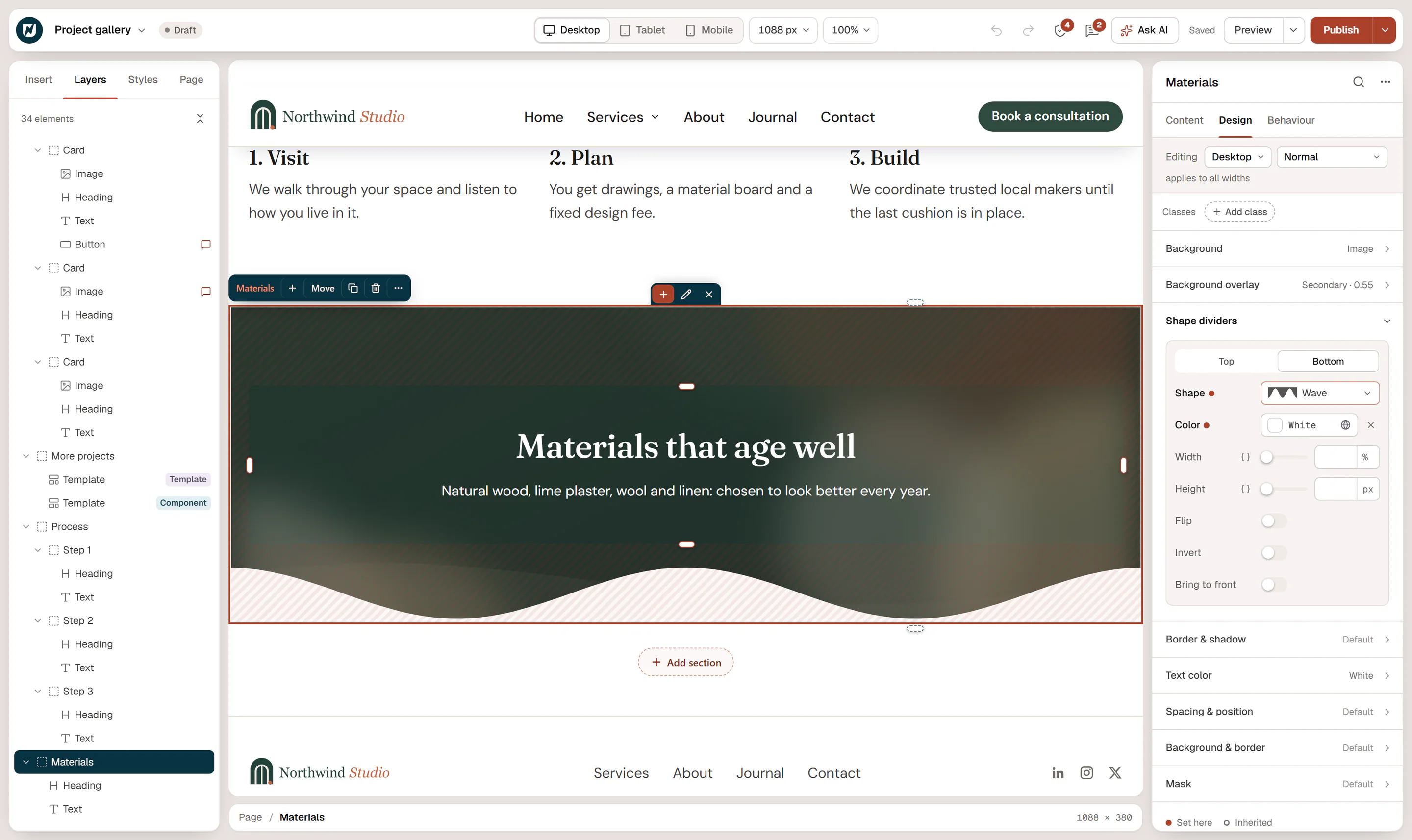
Add a shape divider
Select the section
Select the container (usually a top-level section) and open Design → Shape dividers.
Choose the edge
Click Top or Bottom.
Pick a shape
Choose one of 15 shapes: Tilt, Layered tilt, Triangle, Triangle (asymmetric), Arrow, Split, Curve, Curve (asymmetric), Book, Wave, Layered waves, Mountains, Zigzag, Pyramids or Clouds.
Match the color
Set Color to the background color of the neighbouring section, so the shape looks like part of it. White is the default.
| Setting | What it does |
|---|---|
| Width | Stretches the shape horizontally, 100% to 300%. Wider values make gentler waves. |
| Height | How tall the shape is, in px or vw. It can differ per device. |
| Flip | Mirrors the shape horizontally. |
| Invert | Uses the negative of the shape: the filled and empty parts swap (not available for Layered tilt, Layered waves and Mountains). |
| Bring to front | Draws the shape over the section's content instead of behind it. |
A section can have a divider at the top and another at the bottom. The bottom divider is the top one turned around, so the same shape fits both edges.
Give the section enough padding at the edge with the divider, so the shape does not cover text or buttons.
Crop an element to a shape (mask)
Select the element
Select an image, a video, a container or any other element, and open Design → Mask.
Pick a shape
Choose a Shape: Circle, Rounded square, Blob, Arch, Hexagon, Triangle, Diamond, Star, Heart, Speech bubble, Flower or Wavy bottom.
Adjust the fit
Set Size (Fit, Fill, Stretch or Custom with a Mask width), Position and Repeat.
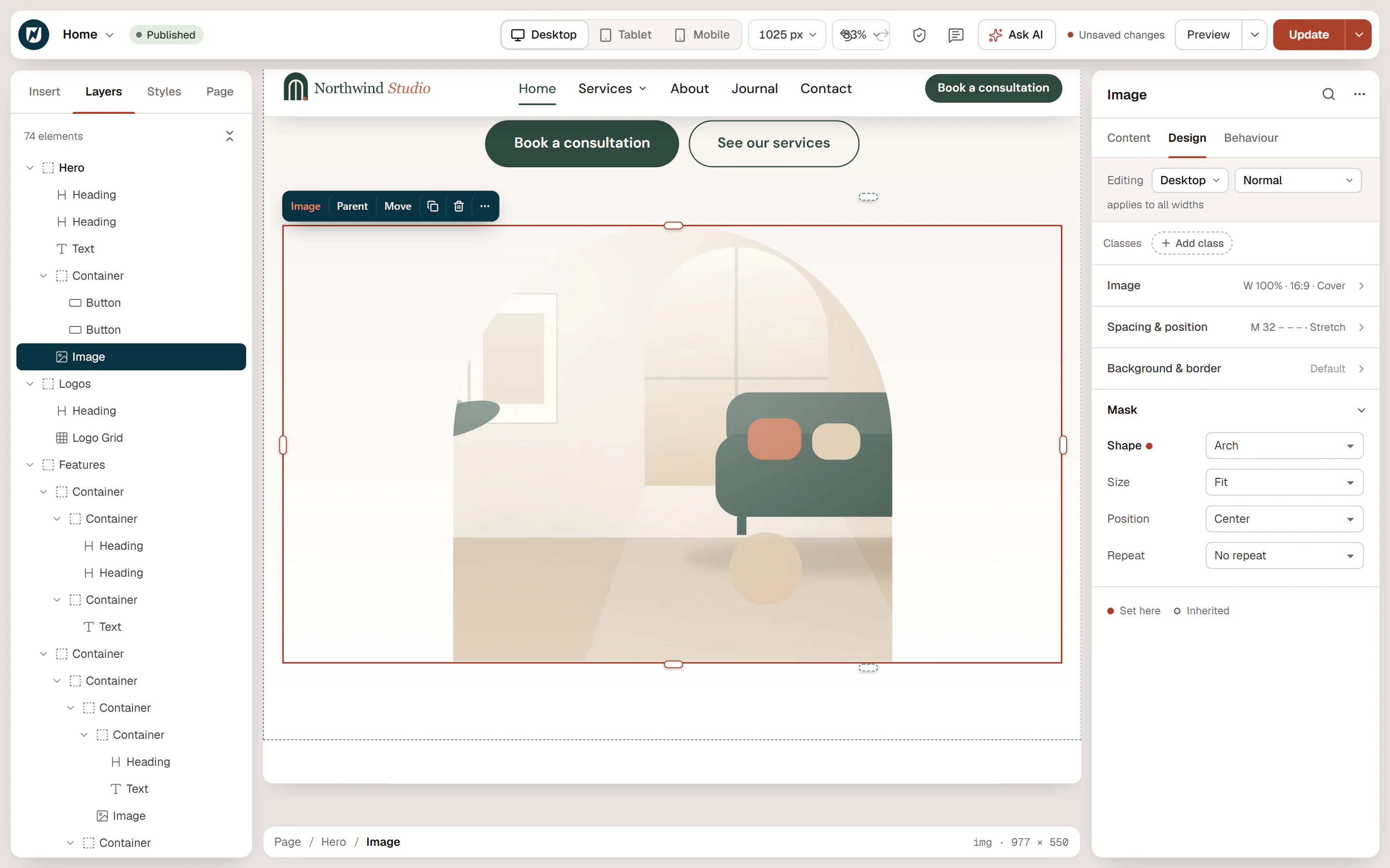
The element is visible only inside the shape; the rest becomes transparent. It still takes the same space on the page.
Use your own shape
Choose Custom image (SVG / PNG) as the Shape and pick a Mask image. Opaque parts of the image show the element; transparent parts hide it. A black SVG shape on a transparent background works best.
Masks or rounded corners?
For a simple circle or rounded corners on an image, Border radius is enough (50% makes a circle on a square image). Use a mask for shapes that border radius cannot make, such as arches, blobs, stars or your own outline. See Borders, radius & shadows.