Flip Box
A card that turns over to reveal a back side on hover, keyboard focus or tap.
On this page
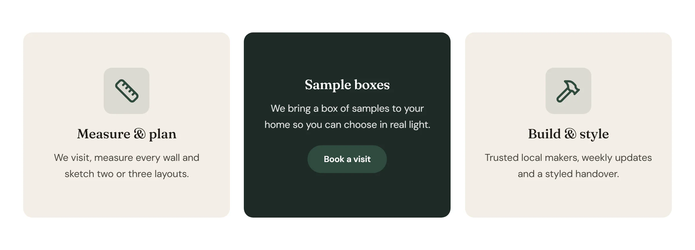
The Flip Box widget is a two-sided card. The front shows an icon or image, a title and a short text. When a visitor hovers over it, tabs to it or taps it, the card turns over and shows the back, with more text and a button. Use it for services, features or steps where a short teaser leads to details.
Add a Flip Box
Open Insert in the left panel and find Flip Box in the Marketing group, or type "flip" in the search box. Drag it onto the canvas, or click it to add it next to the selected element. See Add elements.
To place several cards side by side, put them in a row or grid container. See Grid layouts.
Edit the front and the back
The Content tab has one section for each side:
- Front: pick a Graphic (None, Icon or Image), then write the Title and Description.
- Back: write the Title and Description, then set the button's Button text and Button link.
To check the back side on the canvas, hover over the card. Visitors on phones and tablets tap the card to turn it over, and tap outside it (or press Esc) to turn it back. Buttons and links on the back still work with a tap.
Content tab settings
| Setting | What it does |
|---|---|
| Graphic | None, Icon or Image above the front title. Default: Icon. |
| Icon | The icon on the front. Shown when Graphic is Icon. |
| Image | The image on the front. Shown when Graphic is Image. Supports dynamic data. |
| Title | The front title. Supports dynamic data. |
| Description | The front text. Supports dynamic data. |
| Setting | What it does |
|---|---|
| Title | The back title. Supports dynamic data. |
| Description | The back text. Supports dynamic data. |
| Button text | The button label. Supports dynamic data. |
| Button link | Where the button goes. Without a link the button is hidden, and the card itself can take keyboard focus so keyboard users can still reveal the back. |
| Button style | Primary, Secondary, Outline, Ghost or Text link, from your Design System. Default: Primary. |
| Button size | S, M, L or XL. Default: M. |
| Setting | What it does |
|---|---|
| Effect | How the back appears: Flip horizontal, Flip vertical, Slide, Fade or Zoom. Default: Flip horizontal. |
| Slide from | Bottom, Top, Right or Left. Default: Bottom. Shown for the Slide effect. |
| 3D depth | Lifts the content off the card while it flips. Off by default. Shown for the flip effects. |
| Duration (ms) | How long the effect takes (100–3000). |
| Title HTML tag | The tag of both titles: H1 to H6, DIV, SPAN or P. Default: H3. |
Design tab settings
| Section | Settings |
|---|---|
| Box | Height (both sides share it; 320px by default), Border radius, Border, Shadow, Focus ring color (the outline shown when the card has keyboard focus). |
| Front | Background (color, gradient or image; the surface color by default), Overlay (tints a background image so the text stays readable), Text color, Padding, Alignment, Vertical position. Icon / image: Icon color, Icon background, Icon size or Image width and Image radius, Spacing below. Title: Typography, Color, Spacing below. Description: Typography, Color. |
| Back | Background (the secondary color by default), Overlay, Text color, Padding, Alignment, Vertical position. Title: Typography, Color, Spacing below. Description: Typography, Color. |
| Button | Typography, Text color, Background and Border color (with Normal and Hover tabs), Border radius, Spacing above. Shown when there is button text. |
The Design tab also has the sections every element shares: Spacing & position, Background & border and Mask. See Spacing, size & position.
Behaviour tab
The Behaviour tab has the settings every element shares: anchor and classes, entrance animations, motion effects, visibility per device, display conditions and interactions. See Motion & effects.
Tips
- Both sides have the same height. Keep the back text short, or raise Height in Design → Box, so nothing is cut off.
- Put the important information on the front too. Some visitors never turn the card over.
- Visitors who prefer reduced motion see the back appear instantly, without the animation.