Typography
Fonts, sizes, weights, line height and text styles for any element.
Text elements such as headings, text blocks and buttons have Typography settings in their Design tab. The quickest and most consistent way to style text is to pick one of your Design System text styles. You can then change single properties, such as the weight, for that element only.
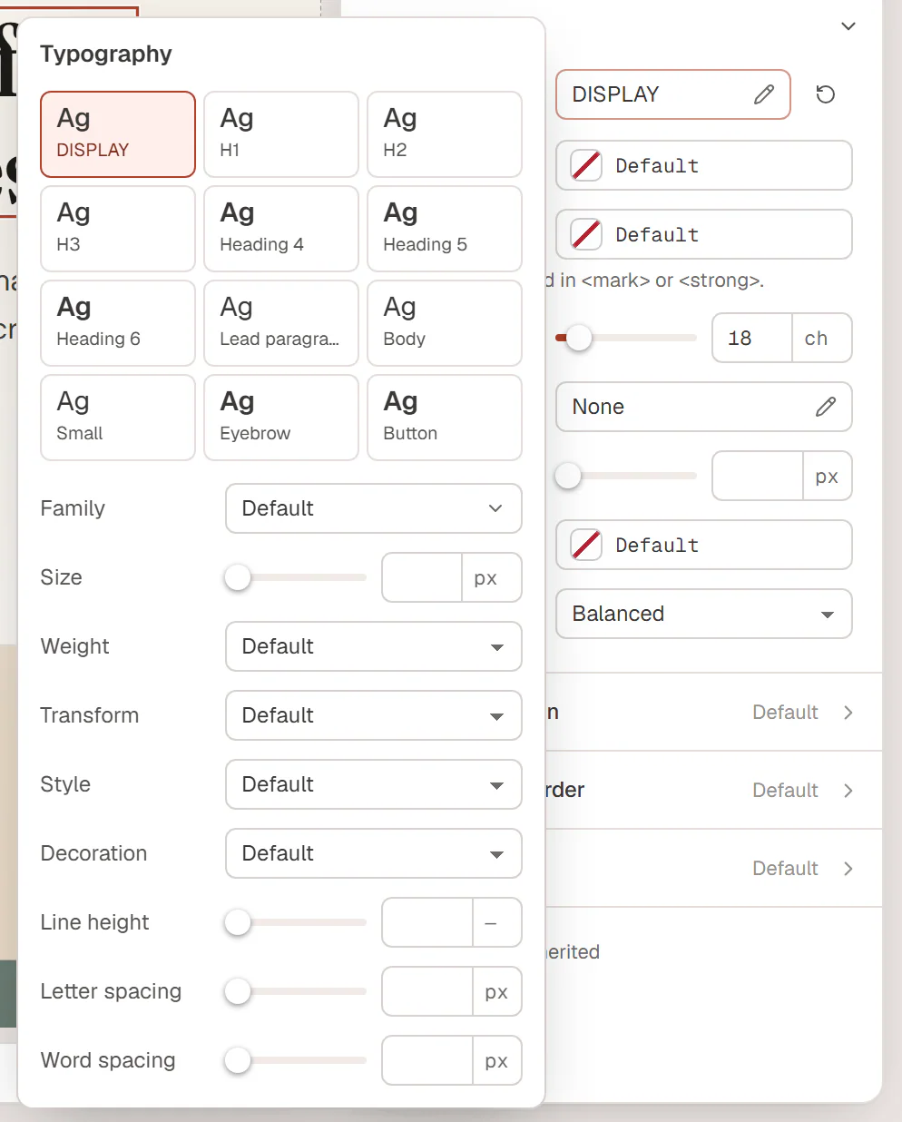
Pick a text style
- Select the element and open its Design tab.
- In the text section (for example Title on a heading), click the Typography button. It shows the current style, or Default.
- Click a tile at the top, such as H2, Lead paragraph or Eyebrow.
The element now follows that text style: when you change the style in the Design System, every element that uses it changes too. Click the tile again to remove it.
The heading level (h1, h2…) is for the structure of the page; the text style is for the look. A section heading should usually be an h2 even if you want it to look smaller, like H4. Set the level with HTML tag in the Content tab and the look with a tile.
Change single properties
Below the tiles you can set each property yourself. A value you set overrides the text style for this element only.
| Setting | What it does |
|---|---|
| Family | The font. Pick a Site font (heading or body font), a custom font or a Google font. |
| Size | The font size in px, rem, em or vw, or custom (for example clamp(2rem, 5vw, 3.5rem)). |
| Weight | From 100 · Thin to 900 · Black. |
| Transform | UPPERCASE, lowercase or Capitalize. |
| Style | Italic or Oblique. |
| Decoration | Underline, Overline or Line through. |
| Line height | The height of each line, for example 1.4 (without a unit) or 28px. |
| Letter spacing | The space between letters, in px or em. |
| Word spacing | The space between words. |
Size, Line height, Letter spacing and Word spacing can differ per device: switch to Tablet or Mobile in the top bar and change them. See Responsive editing.
The reset icon next to the Typography button clears all typography settings of the element, so it goes back to its default look.
Text color and more
Next to Typography, text elements have settings such as Color, Text shadow and alignment. The Heading widget also has Highlight color (for words wrapped in bold or <mark>), Max width (to keep headlines from getting too wide), Text stroke and Text wrap (Balanced spreads the words evenly over the lines). The exact settings depend on the widget; see its page in Widgets.
Pick colors from Site colors so they follow your palette. See Colors.
Fonts on your site
Fonts you use are loaded automatically. Google fonts come from Google's servers by default; you can serve them from your own server or not load them at all in Urmi → Settings → General → Font delivery. See General settings. To use your own font files, see Custom fonts.
Every extra font and weight makes pages a little slower. Stick to your two Design System fonts and a few weights where you can.