Timeline
A vertical timeline of events with dates, titles, text and markers.
On this page
The Timeline widget tells a story in order: milestones in your company's history, the phases of a project or the program of an event. Each event has a date, a title, a short text and a marker on a vertical line. Events can alternate on both sides of the line and fade in as the visitor scrolls.
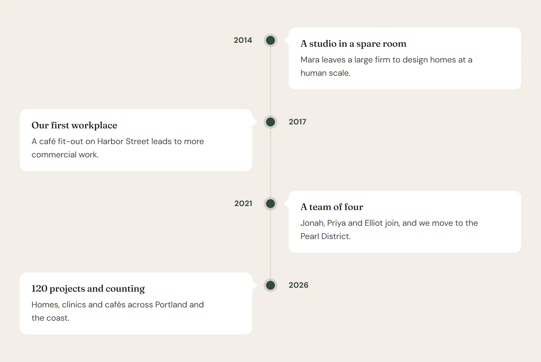
Add a Timeline
Open Insert in the left panel and find Timeline in the Content group, or type "timeline" in the search box. Drag it onto the canvas, or click it to add it next to the selected element. See Add elements.
Each event is a row in Events. Click Add item to add one and drag the handle to reorder. Keep the events in chronological order.
Choose a layout
- Alternating (centre line) places the events left and right of a line in the middle. Below 768px it switches to a line on the left, so it stays readable on phones.
- Line on the left or Line on the right keeps all events on one side.
Pick a Marker: a Dot, a Ring, each event's Icon, or a Number. Give an event its own Marker color to highlight it.
Content tab settings
| Setting | What it does |
|---|---|
| Events | The list of events. |
| Date (each item) | The date or period, such as "2021" or "Spring 2026". |
| Title (each item) | What happened. |
| Description (each item) | A short explanation. |
| Icon (each item) | Shown when Marker is Icon. |
| Marker color (each item) | A color for this event's marker. |
| Title HTML tag | H1 to H6, DIV, SPAN or P. Default: H3. |
| Setting | What it does |
|---|---|
| Layout | Alternating (centre line), Line on the left or Line on the right. Default: Alternating. |
| Marker | Dot, Ring, Icon or Number. Default: Dot. |
| Card pointer | A small arrow from each card toward the line. On by default. |
| Entrance animation | None, Fade up, Fade in or Slide from the side, as each event scrolls into view. Default: Fade up. |
Design tab settings
| Section | Settings |
|---|---|
| Spacing & line | Space between events, Space around the line, Line color, Line width, Line style (Solid, Dashed or Dotted). |
| Marker | Size, Color, Icon / number color (for icons and numbers), Halo color (the soft ring around the marker), Icon size, Number typography. |
| Card | Background, Padding, Border radius, Border, Shadow. |
| Text | Date typography, Date color, Title typography, Title color, Title spacing, Description typography, Description color. |
The Design tab also has the sections every element shares: Spacing & position, Background & border and Mask. See Spacing, size & position.
Behaviour tab
The Behaviour tab has the settings every element shares: anchor and classes, entrance animations, motion effects, visibility per device, display conditions and interactions. See Motion & effects.
Tips
- Events are never hidden in the editor, without JavaScript, or for visitors who prefer reduced motion: the entrance animation only plays when it can.
- On a colored section, give the cards a white Background in Design → Card so they stand out, as in the screenshot above.