Loop Carousel
Repeat a card you design for every post of a query, in a swipeable carousel.
On this page
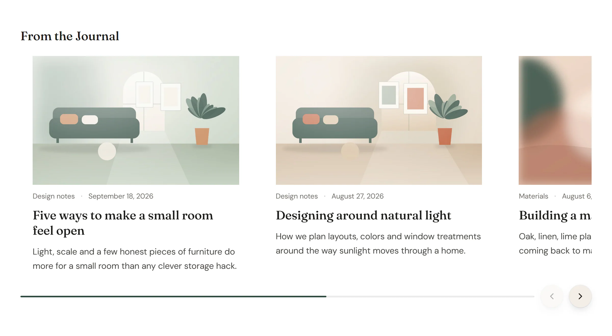
The Loop Carousel widget shows posts (or pages, or any post type) as a row of cards that visitors swipe or click through. Like the Loop Grid, it repeats a Loop item template you design for every item of a query. Use it for "latest from the journal", related posts or a project slider.
Add a Loop Carousel
First design a card as a Loop item template in Urmi → Theme Builder → Loop items and publish it. See Loop items.
Then open Insert in the left panel and find Loop Carousel in the Content group, or type "carousel" in the search box. Drag it onto the canvas, or click it to add it next to the selected element, and choose your card in Loop item template. See Add elements.
Choose which posts to show
The Query works like the Loop Grid's. Pick a Source:
- Custom query: choose the Post type, how many Items (8 by default), the order, and optionally which items, terms or authors to include or exclude.
- Current query (archives): the posts of the page being viewed, for archive templates.
- Related to current post: posts that share a category with the post being viewed. The post itself is always left out.
- Manual selection: exactly the items you pick, in that order.
Set up the carousel
- Slides per view sets how many cards are visible. Use a decimal, such as 2.4, to show part of the next card as a hint that there is more. Set other values in the tablet and mobile views.
- Arrows and Pagination (dots, a "2 / 5" fraction or a progress bar) help visitors move. Touch swipe always works.
- Autoplay moves on by itself after the Delay. It never starts for visitors who prefer reduced motion, pauses while hovered or focused, and has a Pause button by default.
Content tab settings
| Setting | What it does |
|---|---|
| Loop item template | The published Loop item template to repeat for every slide. |
| Query | Which items to show: Source, Post type, Items, Offset, Order by, Order, Include, Exclude, Terms (taxonomy:id), Authors, Ignore sticky posts, Exclude current post and Avoid duplicates (skips items an earlier Loop Grid or Loop Carousel on the page already shows). See Loop Grid. |
| Nothing found message | Shown when there are no items. |
| Featured image as CSS variable | Makes each card's featured image available as the CSS variable var(--urmi-loop-image), for a stylesheet outside Urmi, such as your theme's. Off by default. |
| Setting | What it does |
|---|---|
| Slides per view | Cards visible at once (1–10). Decimals show part of the next card. Can differ per device. |
| Slides to scroll | How many cards move per click (1–10). Can differ per device. |
| Gap | Space between cards. Can differ per device. |
| Vertical alignment | Equal height, Top, Middle or Bottom. |
| Arrows | Shows previous and next buttons. On by default. |
| Arrows position | Inside, over the slides, Outside the slides or Below, next to the pagination. Default: Inside. Shown when Arrows is on. |
| Previous icon, Next icon | The arrow icons. Shown when Arrows is on. |
| Pagination | None, Dots, Fraction (2 / 5) or Progress bar. Default: Dots. |
| Rewind | Next on the last slide goes back to the first one. |
| Mouse drag | Lets visitors drag with the mouse. Touch swipe and trackpads always work. On by default. |
| Transition duration (ms) | How long a move takes (0–3000). Default: 500. |
| Autoplay | Moves on by itself. Never starts for visitors who prefer reduced motion; pauses while hovered or focused. |
| Delay (ms) | Time between moves (1000–30000). Default: 5000. Shown when Autoplay is on. |
| Pause on hover | On by default. Shown when Autoplay is on. |
| Pause button | A button that stops the autoplay, needed for content that moves on its own (WCAG 2.2.2). On by default. Shown when Autoplay is on. |
| Accessible name | The name screen readers announce, such as "Latest articles". |
Design tab settings
| Section | Settings |
|---|---|
| Arrows | Button size, Icon size, Offset (distance from the slides, or between the two arrows when they are below), Icon color, Background, Border and Shadow (Normal tab), Icon color, Background and Border color (Hover tab), Border radius. Shown when Arrows is on. |
| Pagination | Distance from slides, Alignment. Dots: Dot size, Active dot width, Space between dots, Dot color, Active dot color. Fraction: Typography, Color. Progress bar: Bar height, Bar color, Track color. Pause button color with autoplay. |
The look of each card comes from its Loop item template. The Design tab also has the sections every element shares: Spacing & position, Background & border and Mask. See Spacing, size & position.
Behaviour tab
The Behaviour tab has the settings every element shares: anchor and classes, entrance animations, motion effects, visibility per device, display conditions and interactions. See Display conditions.
Tips
- Under a blog post, a Loop Carousel with Related to current post makes a "keep reading" row.
- For more on queries, see Loop grid & carousel.