Heading
A title from h1 to h6 with text style presets and an optional link.
The Heading widget adds a title to your page, from the main H1 to small H6 labels. Its size and font come from the text styles in your Design System, so headings look the same everywhere. You can highlight a word, add a link, limit the line length and outline the letters.
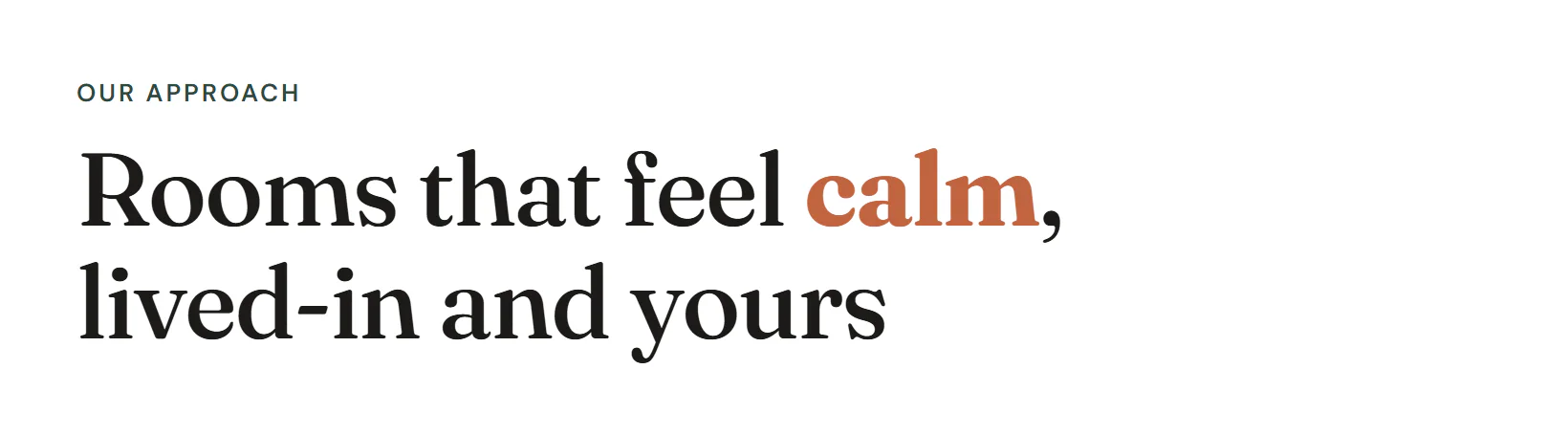
Add a heading
Insert it
Open Insert in the left panel, find Heading under Basic (or type
headingin Search widgets) and click it or drag it onto the canvas.Write the text
Double-click the heading on the canvas and type, or edit Title in Content → Heading.
Choose the level
Set HTML tag to the right level: H1 for the page title, H2 for section titles, H3 for cards inside a section.
Pick a text style
On the Design tab, open Typography and choose a text style from the Design System, such as H2 or Display. The level and the look are separate, so an H2 can look like a display title.
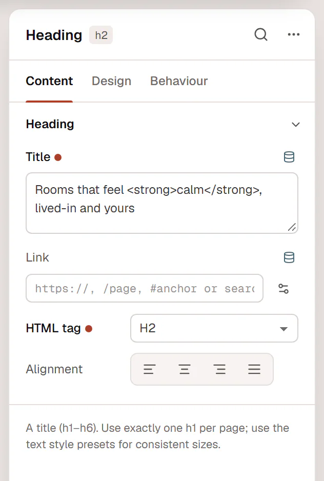
Highlight a word
Wrap a word in <strong> (or <mark>) in the Title, then set Design → Title → Highlight color. In the example above the title is Rooms that feel <strong>calm</strong>, lived-in and yours.
Settings
Settings marked Per device can differ on desktop, tablet and mobile (see Responsive editing). The Title supports dynamic tags, for example to show the current post title in a template (see Dynamic tags).
Content tab
| Setting | What it does |
|---|---|
| Title | The heading text. You can also type on the canvas. Inline tags such as <strong>, <em>, <span> and <br> are allowed. Supports dynamic tags. |
| Link | Makes the whole heading a link: a URL, a page of your site (type to search), #anchor, mailto: or tel:. Link options adds Open in new tab and Add nofollow. Supports dynamic tags. |
| HTML tag | The heading level (H1–H6) or a plain DIV, SPAN or P. It sets the structure for search engines and screen readers, not the size. Use one H1 per page and keep levels in order. Default: H2. |
| Alignment | Aligns the text. Options: Left, Center, Right, Justify. Per device. |
Design tab
| Setting | What it does |
|---|---|
| Typography | A text style from the Design System (Display, H1–H6, Lead…), or your own font, size, weight, line height and spacing. |
| Color | Color of the heading. |
| Link hover color | Color of the heading link on hover. Shown when Link has a URL. |
| Highlight color | Color for words wrapped in <strong> or <mark>, for example one accent word in a title. |
| Max width | Limits the line length, for example 18ch, so long titles wrap nicely. Per device. |
| Text shadow | Shadow behind the letters. |
| Text stroke | An outline around the letters. With a transparent text color you get outlined text. Per device. |
| Stroke color | Color of the outline. |
| Text wrap | Balanced evens out the line lengths of short multi-line titles; Pretty avoids a single word on the last line. Options: Default, Balanced, Pretty. |
Every element also has these sections at the end of the Design tab.
| Section | What it does |
|---|---|
| Spacing & position | Margin, padding, width, alignment in its container, order, position (relative, absolute, fixed), offsets, z-index and global classes. See Spacing, size & position. |
| Background & border | Background, border, border radius, box shadow, overflow and opacity of the whole element. See Colors & backgrounds and Borders & shadows. |
| Mask | Crops the element to a shape (circle, arch, blob, star…) or your own SVG or PNG. See Shape dividers & masks. |
Behaviour tab
The Behaviour tab is the same for every element.
| Section | What it does |
|---|---|
| Anchor & classes | An Anchor ID for #links and your own CSS classes. |
| Animations | Entrance, scroll, hover and loop animations from presets or your own timeline. See Motion & effects. |
| Motion & effects | A simple entrance animation, transforms (also on hover), CSS and backdrop filters, and sticky positioning. |
| Scroll & mouse effects | Movement, rotation, scale, fade and blur while the page scrolls, and pointer effects (follow the pointer, 3D tilt). |
| Visibility | Hide the element on desktop, tablet or mobile, or in dark or light mode. See Visibility. |
| Conditions | Show the element only when rules match, such as logged-in visitors, a date range or a URL parameter. See Display conditions. |
| Interactions | Show, hide or change other elements when this one is clicked, hovered or scrolled into view. See Interactions. |
| Attributes | Custom HTML attributes for this element. See Anchor, classes & attributes. |
Tips
- One H1 per page. Use H1 once, for the main title, and keep levels in order (H2, then H3). Accessibility checks warn about missing or repeated H1s.
- Eyebrows are not headings. Small labels above a title (“Our approach”) should use the P tag with the Eyebrow text style, so they don't clutter the page outline.
- Balanced titles. Text wrap → Balanced evens out the lines of a two- or three-line title; Max width in
chkeeps long titles readable. - Text reveal. Behaviour → Motion & effects → Text reveal animates a hero title word by word or letter by letter. Use it on one title per page.