Dark mode
Give colors dark values and let visitors switch, or follow their device setting.
On this page
Dark mode gives your site a second color scheme for visitors who prefer dark screens. You give each Design System color a dark value, add a switch to your header, and choose whether the site starts light or follows the visitor's device.
How dark mode works
When a visitor switches to dark mode, every Design System color swaps to its dark value. Everything that uses site colors, such as text, headings, backgrounds and buttons, changes with it. Colors typed straight into a field (for example #ffffff) stay the same, so use site colors for anything that should change.
The page switches before it is shown, so visitors never see a flash of the wrong colors. Their choice is remembered in their browser for later visits.
Turn on dark mode
Choose a mode
In the editor, open Styles → Colors and set Dark mode:
- Off — light only: no dark mode (the default).
- On, with a switch (starts light): the site is light until a visitor uses the switch.
- Follow the visitor’s device (with a switch): the site follows the light or dark setting of the visitor's phone or computer, and visitors can still switch.
Give each color a dark value
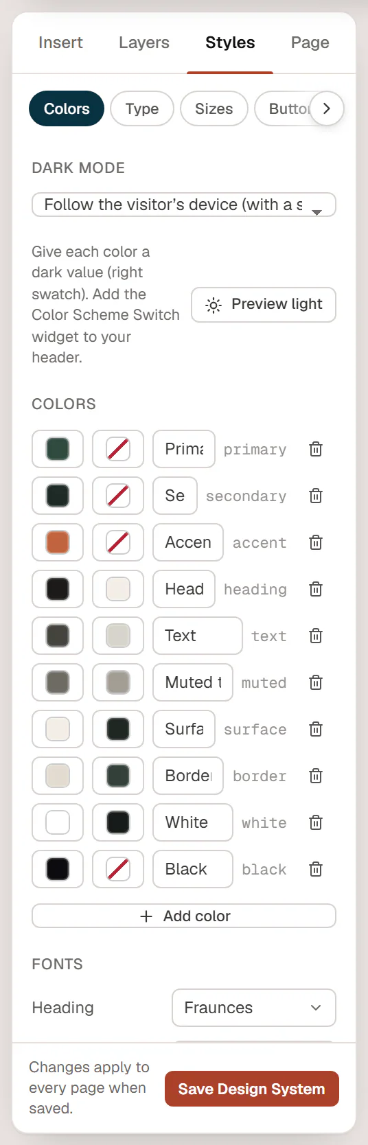
Each color now has a second swatch on the right: its dark value. Pick a dark value for the colors that should change, typically the backgrounds (Surface, White), the text colors (Text, Headings, Muted text) and the borders. A color without a dark value keeps its normal value in dark mode.
Preview it
Click Preview dark above the colors to see the canvas in dark mode while you work. Click Preview light to go back. This only changes your view in the editor.
Save
Click Save Design System.
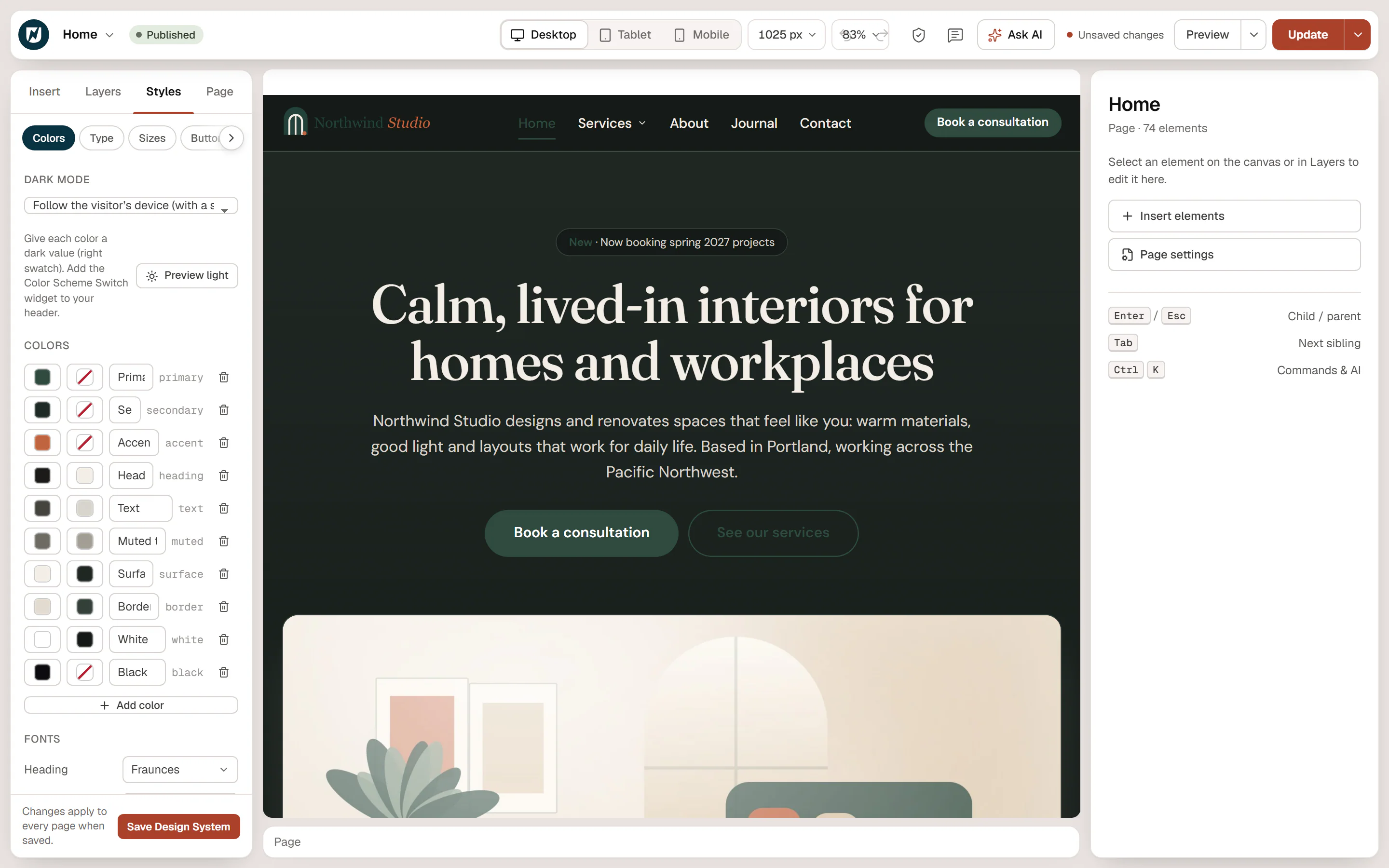
Set Page background in Styles → Theme to a site color with a dark value, such as White or Surface. Otherwise the page background itself stays light in dark mode.
Add a switch for visitors
Visitors need a way to switch. Add the Color Scheme Switch widget (in the Site & theme group of the Insert panel), usually to your header:
- Open your header in the Theme Builder.
- Add Color Scheme Switch next to the menu.
- Choose its Style: Icon button (a moon or sun icon) or Switch (a small toggle between a sun and a moon).
- Update the header.
All switches on a page stay in sync. When dark mode is off in the Design System, the widget shows nothing to visitors, and the editor reminds you: Dark mode is off. Turn it on in Design System → Colors → Dark mode. See Color Scheme Switch.
Show different elements in light and dark mode
Some things need a different version in dark mode, for example a dark logo on light pages and a light logo on dark pages. Add both, then in Behaviour → Visibility:
- turn on Hide in dark mode on the element for light pages;
- turn on Hide in light mode on the element for dark pages.
See Visibility.
Check contrast
Dark themes need the same care as light ones: make sure text stays readable on its background. Use Preview dark, then run the accessibility checks to spot low-contrast text.