Loop Filter
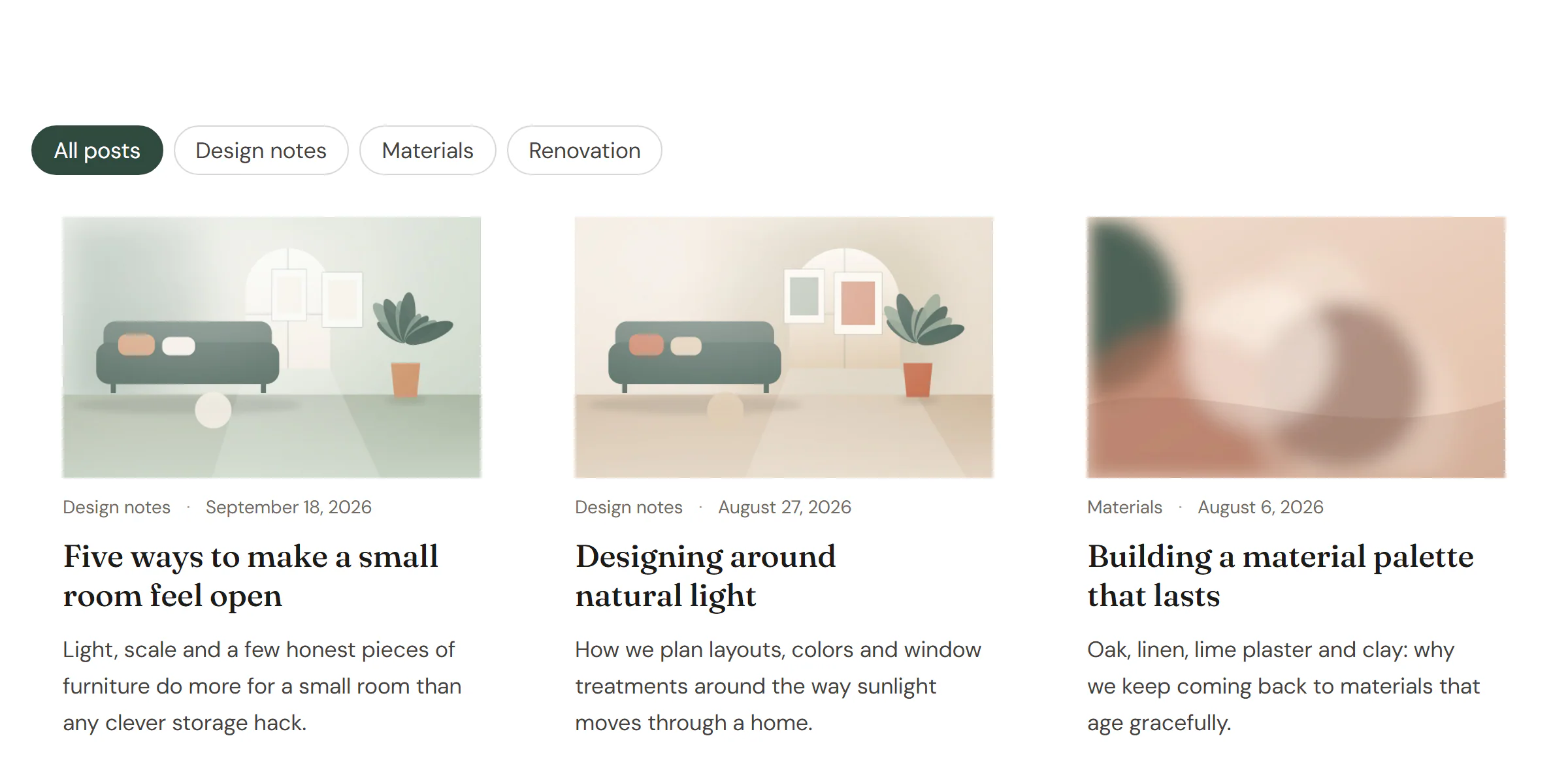
Category buttons, a dropdown, checkboxes, a search box or a sort menu that filter a post grid without reloading.
On this page
The Loop Filter widget lets visitors narrow down a Loop Grid or Posts widget on the same page: by category or tag, with a search box, or by changing the sort order. The grid updates without reloading the page, and the address in the browser changes too, so a filtered view can be shared or bookmarked.
Add a Loop Filter
Add the grid first. Then open Insert in the left panel, find Loop Filter in the Site & theme group (or type "filter" in the search box) and drag it above the grid. See Add elements.
The filter finds the grid on the page by itself. If the page has several grids, give the one to filter an Anchor ID in its Behaviour → Anchor & classes section, and type the same ID in the filter's Grid anchor ID.
You can add several filters for the same grid, for example category buttons and a search box. They work together.
Choose the kind of filter
- Category, tag or taxonomy: pick the Taxonomy and a Display: Buttons (with Allow several at once if visitors may pick more than one), a Dropdown or Checkboxes.
- Search: a search box that filters the grid by the words typed.
- Sort order: a menu with the Sort options you choose, such as Newest first or Title A–Z.
Without JavaScript, the filter still works: buttons are plain links and the search and sort use a normal form, so the page reloads with the filtered grid.
Content tab settings
| Setting | What it does |
|---|---|
| Grid anchor ID | The Anchor ID of the Loop Grid or Posts widget to filter. Only needed when a page has several grids. |
| Filter by | Category, tag or taxonomy, Search or Sort order. Default: Category, tag or taxonomy. |
| Taxonomy | Categories or Tags (and other public taxonomies of your site). Default: Categories. |
| Display | Buttons, Dropdown or Checkboxes. Default: Buttons. |
| Allow several at once | Visitors can select more than one button. Shown for Buttons. |
| Show "All" | Adds a button or option that clears the filter. On by default. Not shown for checkboxes. |
| "All" label | The text of that option. Default: All. |
| Show counts | Shows the number of posts next to each term. |
| Hide empty terms | Leaves out terms without posts. On by default. |
| Top-level terms only | Leaves out child categories. |
| Placeholder | The hint text in the search box. Default: Search…. Shown for Search. |
| Sort options | Any of Newest first, Oldest first, Title A–Z, Title Z–A, Recently updated, Most commented and Custom order. Default: Newest first, Oldest first, Title A–Z. Shown for Sort order. |
| Label | Text shown before the filter; also its name for screen readers. |
Design tab settings
| Section | Settings |
|---|---|
| Buttons & fields | Alignment, Gap, Typography, Text color, Background, Border color, Active text and Active background (the selected button), Radius, Padding. |
The Design tab also has the sections every element shares: Spacing & position, Background & border and Mask. See Spacing, size & position.
Behaviour tab
The Behaviour tab has the settings every element shares: anchor and classes, entrance animations, motion effects, visibility per device, display conditions and interactions. See Visibility.
Tips
- On phones, a Dropdown takes less room than a long row of buttons. Use two filters, one hidden on mobile and one hidden on desktop, with Behaviour → Visibility.
- Filtering works on the grid's own query: a grid that shows only one category can be filtered by tag, for example.