Share Buttons
Buttons that share the current page on social networks, by email, by copying the link or with the device's share sheet.
On this page
The Share Buttons widget lets visitors share a page in one click: on Facebook, X, LinkedIn, WhatsApp, Telegram, Pinterest or Reddit, by email, by copying the link, or with the share sheet of their phone. The buttons are plain links, so no social network scripts are loaded on your site.
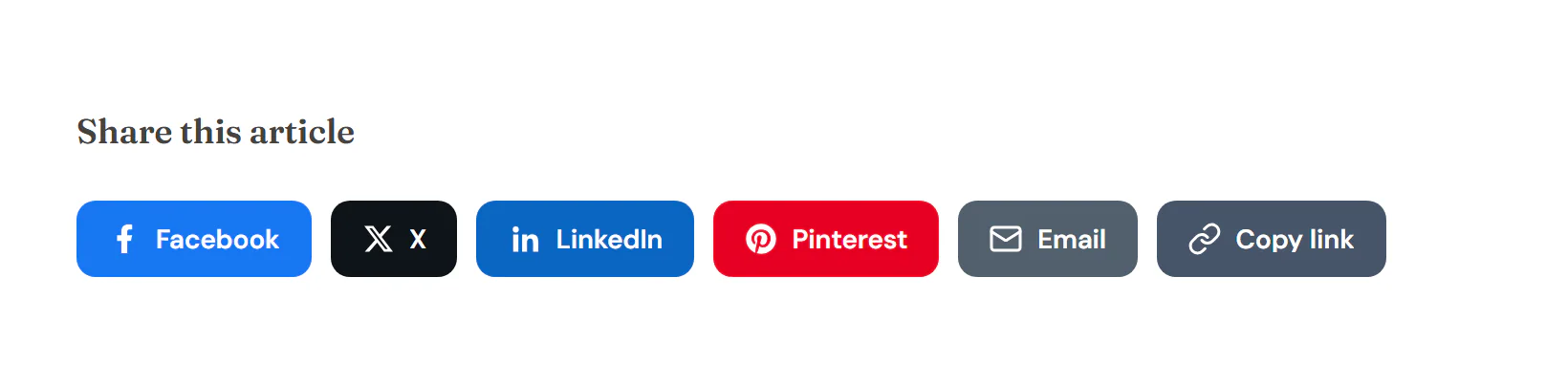
Add Share Buttons
Open Insert in the left panel and find Share Buttons in the Marketing group, or type "share" in the search box. Drag it onto the canvas, or click it to add it next to the selected element. See Add elements.
The best place for share buttons is your blog post template, so every post gets them. See Single post and page layouts.
Choose the networks
Each button is a row in Buttons. Click Add item and pick a Network. Two special buttons are available:
- Copy link copies the page address and briefly shows the "Copied" feedback text.
- Share… opens the device's own share sheet (on phones and some browsers). It only appears on devices that have one.
Choose what is shared
By default the buttons share the page they are on, with its title. In a blog post template, that is each post. Pinterest also gets the featured image. To always share one address, set Share to Custom URL and type it in URL to share. Share text replaces the title in networks that take a text.
Content tab settings
| Setting | What it does |
|---|---|
| Buttons | The list of share buttons, in order. |
| Network (each item) | Facebook, X, LinkedIn, WhatsApp, Telegram, Pinterest, Reddit, Email, Copy link or Share… (the device share sheet). Default: Facebook. |
| Custom label (each item) | Replaces the network name on the button. |
| Custom color (each item) | A color for this button only. |
| Share | Current page or Custom URL. Default: Current page. |
| URL to share | The address to share. Shown for Custom URL. Supports dynamic data. |
| Share text | The text shared with the link. Defaults to the page title. Supports dynamic data. |
| "Copied" feedback | The text shown after Copy link is clicked. Default: Link copied. |
| Setting | What it does |
|---|---|
| View | Icon, Text or Icon and text. Default: Icon. |
| Skin | Solid, Soft tint, Outline or Minimal. Default: Solid. |
| Shape | Square, Rounded or Circle / pill. Default: Rounded. |
| Size | S, M or L. Default: M. |
| Colors | Official brand colors or One custom color. Default: Official brand colors. |
| Color | The single color for all buttons. Shown for One custom color. |
| Columns | Auto (inline) keeps the buttons in a row; 1 to 6 makes equal-width buttons in a grid. Can differ per device. |
| Alignment | Left, Center, Right or Stretch. Can differ per device. |
Design tab settings
| Section | Settings |
|---|---|
| Buttons | Gap, Button height, Icon size, Padding (with text) and Label typography (when the view shows text), Border radius, Border width. Background, Icon & text color, Border color and Shadow on the Normal tab; Background, Icon & text color, Border color and Hover effect (None, Lift or Grow; Lift by default) on the Hover tab. |
The Design tab also has the sections every element shares: Spacing & position, Background & border and Mask. See Spacing, size & position.
Behaviour tab
The Behaviour tab has the settings every element shares: anchor and classes, entrance animations, motion effects, visibility per device, display conditions and interactions. See Visibility.
Tips
- In the Icon view, every button still has a name for screen readers.
- A sticky row of icon buttons at the side of a long article is easy to build: set Sticky to Top in Behaviour → Motion & effects.