Social Icons
Icon links to your social profiles, email or phone.
The Social Icons widget shows a row of icon links to your profiles on Instagram, LinkedIn, Pinterest, YouTube and more, or to your email, phone and website. Icons come in each network's brand color or in your own colors, as filled shapes, outlines or plain icons, with optional labels. Every icon has an accessible name.
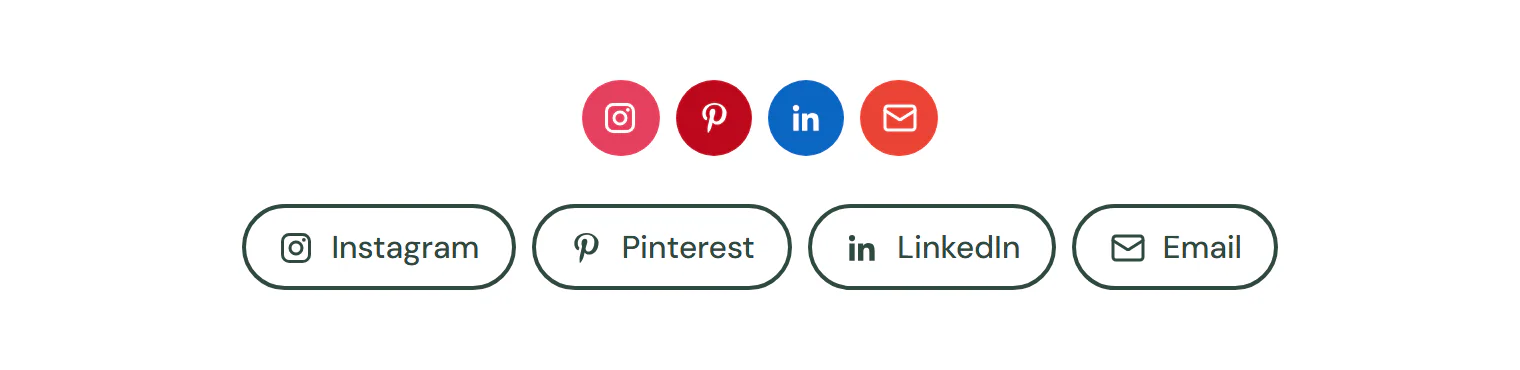
Add social icons
Insert it
Open Insert in the left panel, find Social Icons under Basic (or type
socialin Search widgets) and click it or drag it onto the canvas.Add your profiles
In Content → Social icons → Icons, click an icon, choose its Network and paste your profile address in Link. Add item adds another; drag the handle to reorder.
Choose the look
Pick a View (Filled shape, Outlined shape or Icon only), a Shape, and Brand or Custom colors.
Settings
Settings marked Per device can differ on desktop, tablet and mobile (see Responsive editing). Links support dynamic tags (see Dynamic tags).
Content tab
| Setting | What it does |
|---|---|
| Icons | The icons. Add item, drag to reorder, Duplicate item and Delete item. |
| View | Filled shape puts the icon on a colored shape, Outlined shape inside an outline, Icon only without a shape. Options: Filled shape, Outlined shape, Icon only. Default: Filled shape. |
| Shape | The shape of the icons. Options: Circle, Rounded, Square. Default: Circle. Shown when View is not Icon only. |
| Colors | Brand uses each network’s own color; Custom uses your colors from the Design tab. Options: Brand, Custom. Default: Brand. |
| Show labels | Shows the name next to each icon. |
| Open in a new tab | Opens the links in a new tab. On by default. |
| Alignment | Aligns the icons. Options: Left, Center, Right. Per device. |
| Setting | What it does |
|---|---|
| Network | The network or link type. Each has its own icon and brand color. Custom lets you pick any icon. Options: Facebook, X, Instagram, LinkedIn, YouTube, TikTok, Pinterest, GitHub, Dribbble, Behance, WhatsApp, Telegram, Discord, Threads, Mastodon, Reddit, Email, Phone, Website, RSS, Custom. Default: Facebook. |
| Link | The address of your profile, an email (mailto:) or a phone number (tel:). Supports dynamic tags. |
| Icon | The icon for a Custom link. Shown when Network is Custom. |
| Label | Name read by screen readers (and shown when labels are on). Defaults to the network name. |
| Color | A color for this icon only, instead of the brand or custom color. |
Design tab
| Setting | What it does |
|---|---|
| Size | Size of the icons. Per device. |
| Padding | Space between the icon and the edge of its shape. Shown when View is not Icon only. Per device. |
| Spacing | Space between the icons. Per device. |
| Rows gap | Space between rows when the icons wrap. Per device. |
| Outline width | Width of the outline. Shown when View is Outlined shape. |
| Border radius | Corner radius of the shapes. Shown when View is not Icon only. Per device. |
| Normal › Primary color | Shape color (filled) or icon and outline color (outlined, icon only). Shown when Colors is Custom. |
| Normal › Secondary color | Icon color on a filled shape. Shown when View is Filled shape. |
| Hover › Icon color | Icon color on hover. |
| Hover › Shape color | Shape color on hover. Shown when View is not Icon only. |
| Hover › Outline color | Outline color on hover. Shown when View is Outlined shape. |
| Hover › Hover animation | An animation on hover. Options: None, Grow, Lift, Shrink, Rotate. |
| Shadow | Shadow of the icons. |
This section shows when Show labels is on.
| Setting | What it does |
|---|---|
| Typography | Text style or font, size, weight and spacing of the labels. |
| Icon spacing | Space between the icon and its label. Per device. |
Every element also has these sections at the end of the Design tab.
| Section | What it does |
|---|---|
| Spacing & position | Margin, padding, width, alignment in its container, order, position (relative, absolute, fixed), offsets, z-index and global classes. See Spacing, size & position. |
| Background & border | Background, border, border radius, box shadow, overflow and opacity of the whole element. See Colors & backgrounds and Borders & shadows. |
| Mask | Crops the element to a shape (circle, arch, blob, star…) or your own SVG or PNG. See Shape dividers & masks. |
Behaviour tab
The Behaviour tab is the same for every element.
| Section | What it does |
|---|---|
| Anchor & classes | An Anchor ID for #links and your own CSS classes. |
| Animations | Entrance, scroll, hover and loop animations from presets or your own timeline. See Motion & effects. |
| Motion & effects | A simple entrance animation, transforms (also on hover), CSS and backdrop filters, and sticky positioning. |
| Scroll & mouse effects | Movement, rotation, scale, fade and blur while the page scrolls, and pointer effects (follow the pointer, 3D tilt). |
| Visibility | Hide the element on desktop, tablet or mobile, or in dark or light mode. See Visibility. |
| Conditions | Show the element only when rules match, such as logged-in visitors, a date range or a URL parameter. See Display conditions. |
| Interactions | Show, hide or change other elements when this one is clicked, hovered or scrolled into view. See Interactions. |
| Attributes | Custom HTML attributes for this element. See Anchor, classes & attributes. |
Tips
- Networks included. Facebook, X, Instagram, LinkedIn, YouTube, TikTok, Pinterest, GitHub, Dribbble, Behance, WhatsApp, Telegram, Discord, Threads, Mastodon, Reddit, Email, Phone, Website and RSS, plus Custom with any icon.
- Email and phone. Use
mailto:hello@example.comandtel:+15035550147as links for the Email and Phone networks. - New tabs are announced. With Open in a new tab on, screen readers hear “opens in a new tab” for each link.
- Brand or calm. Brand colors stand out; for a quieter footer, choose Custom colors and Icon only.
- Share buttons are different. To let visitors share a page, use Share Buttons.