Divider
A horizontal line, optionally with a label or an icon in the middle.
The Divider widget draws a horizontal line between pieces of content. It can be solid, dashed, dotted or double, shorter than its container, and carry a short text or an icon in the middle, such as “or” between two options.
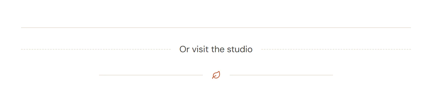
Add a divider
Insert it
Open Insert in the left panel, find Divider under Basic (or type
dividerin Search widgets) and click it or drag it onto the canvas.Choose the line
Pick a Style and a Width; with a width below 100%, use Alignment to place it.
Add text or an icon
Set Add element to Text or Icon and fill in the text or pick the icon.
Adjust color and spacing
On the Design tab, set the line Color, Weight and the Vertical spacing above and below it.
Settings
Settings marked Per device can differ on desktop, tablet and mobile (see Responsive editing).
Content tab
| Setting | What it does |
|---|---|
| Style | The line style. Options: Solid, Dashed, Dotted, Double. Default: Solid. |
| Width | Length of the line, in % of the container or in px. Per device. |
| Alignment | Aligns a line that is shorter than its container. Options: Left, Center, Right. Per device. |
| Add element | Adds text or an icon in the middle of the line. Options: None, Text, Icon. |
| Text | The text in the middle of the line. Shown when Add element is Text. |
| Icon | The icon in the middle of the line. Shown when Add element is Icon. |
Design tab
| Setting | What it does |
|---|---|
| Color | Color of the line. |
| Weight | Thickness of the line. Per device. |
| Vertical spacing | Space above and below the line. Per device. |
| Text typography | Text style or font, size, weight and spacing of the text. Shown when Add element is Text. |
| Text / icon color | Color of the text or icon. Shown when Add element is set. |
| Element spacing | Space between the line and the text or icon. Shown when Add element is set. |
Every element also has these sections at the end of the Design tab.
| Section | What it does |
|---|---|
| Spacing & position | Margin, padding, width, alignment in its container, order, position (relative, absolute, fixed), offsets, z-index and global classes. See Spacing, size & position. |
| Background & border | Background, border, border radius, box shadow, overflow and opacity of the whole element. See Colors & backgrounds and Borders & shadows. |
| Mask | Crops the element to a shape (circle, arch, blob, star…) or your own SVG or PNG. See Shape dividers & masks. |
Behaviour tab
The Behaviour tab is the same for every element.
| Section | What it does |
|---|---|
| Anchor & classes | An Anchor ID for #links and your own CSS classes. |
| Animations | Entrance, scroll, hover and loop animations from presets or your own timeline. See Motion & effects. |
| Motion & effects | A simple entrance animation, transforms (also on hover), CSS and backdrop filters, and sticky positioning. |
| Scroll & mouse effects | Movement, rotation, scale, fade and blur while the page scrolls, and pointer effects (follow the pointer, 3D tilt). |
| Visibility | Hide the element on desktop, tablet or mobile, or in dark or light mode. See Visibility. |
| Conditions | Show the element only when rules match, such as logged-in visitors, a date range or a URL parameter. See Display conditions. |
| Interactions | Show, hide or change other elements when this one is clicked, hovered or scrolled into view. See Interactions. |
| Attributes | Custom HTML attributes for this element. See Anchor, classes & attributes. |
Tips
- Structure first. A divider is decoration. To separate sections, alternating section backgrounds or more spacing often looks cleaner.
- Borders instead. To underline a heading or separate cards, a border on the container (Design → Border & shadow) can be simpler than an extra widget.