Link in Bio
A complete mobile-first link page in one widget: photo, name, bio, social icons and big link buttons.
On this page
The Link in Bio widget builds a whole "link in bio" page in one element: a round profile photo, your name and handle, a short bio, social icons, a stack of large link buttons and a footer line, centered in a narrow column. Use it for the page you link from Instagram, TikTok or another profile that allows a single link.
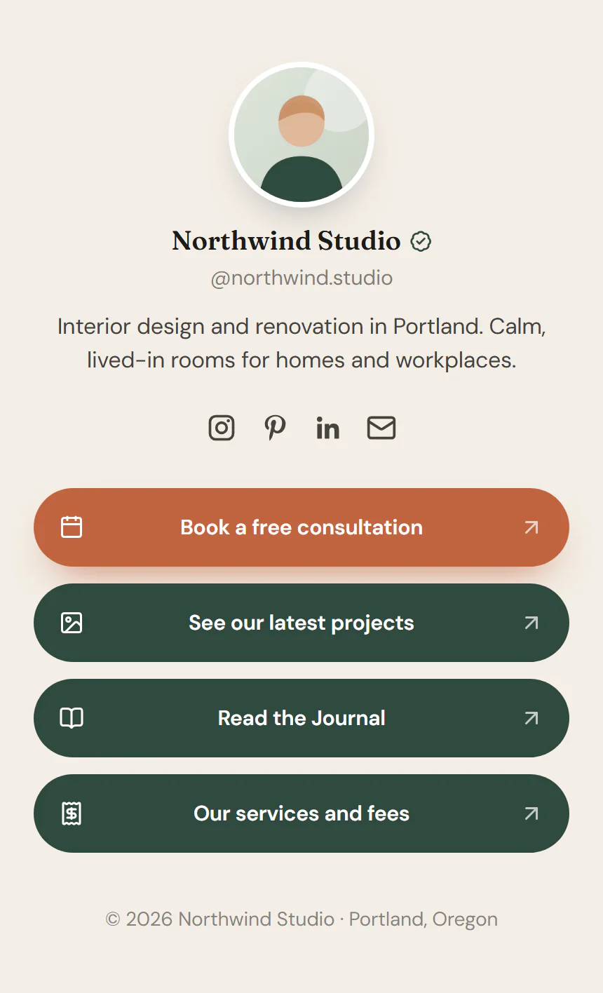
Build a link page
Create a page for it
Go to Urmi → Home, click New page and name it, for example "Links".
Use the blank page template
In the editor, open the Page tab in the left panel and set Page template to Urmi Canvas (no header/footer). See Page settings.
Add the widget
Open Insert, find Link in Bio in the Marketing group and drag it onto the page.
Fill the screen
Select the widget, open Design → Layout & background and turn on Fill the screen. The column is now at least as tall as the screen, with the content centered.
Add your links
Fill in the Profile, add a row per link under Links, and add your Social icons. Then publish the page.
Highlight one link
To make one link stand out, open it in the Links list and turn on Highlight. It takes the accent color by default. Pick a Highlight animation (Pulse or Wobble) under Links to draw even more attention. Highlight one link at most, so it keeps its effect.
Content tab settings
| Setting | What it does |
|---|---|
| Profile photo | Shown round. Without a photo, the initials of the name are shown. Supports dynamic data. |
| Show photo or initials | Shows or hides the photo circle. On by default. |
| Name | Your name or brand. Supports dynamic data. |
| Name HTML tag | H1, H2, H3, P or DIV. Default: H1. Use H1 on a page of its own, H2 when the page already has a main title. |
| Verified badge | Adds a small check badge after the name. |
| Handle | Your handle, such as "@username". |
| Bio | One or two short sentences about you. Supports dynamic data. |
| Setting | What it does |
|---|---|
| Links | The list of link buttons. Click Add item to add one, drag the handle to reorder. |
| Label (each item) | The text of the button. Supports dynamic data. |
| Link (each item) | Where it goes. Supports dynamic data. |
| Icon (each item) | An optional icon at the start of the button. |
| Highlight (each item) | Makes this link stand out with the accent color and the optional animation. |
| Button style | Filled, Outline or Soft (tinted), based on your Design System buttons. Default: Filled. |
| Label alignment | Left or Center. Default: Center. |
| Arrow at the end | Adds a small arrow at the end of every button. |
| Highlight animation | None, Pulse or Wobble for the highlighted link. |
| Setting | What it does |
|---|---|
| Profiles | The list of social links. |
| Network (each item) | Facebook, X, Instagram, LinkedIn, YouTube, TikTok, Pinterest, GitHub, Dribbble, Behance, WhatsApp, Telegram, Discord, Threads, Mastodon, Reddit, Email, Phone, Website, RSS or Custom. Default: Instagram. |
| Link (each item) | The profile address. Use mailto: for email and tel: for phone. |
| Icon (each item) | The icon to show. Shown when Network is Custom. |
| Label (each item) | The name screen readers announce. Defaults to the network name. |
| Position | Above the links or Below the links. Default: Above the links. |
| Style | Icons, Icons in brand colors or Icons in circles. Default: Icons. |
| Open in a new tab | Opens social profiles in a new tab. On by default. |
| Setting | What it does |
|---|---|
| Footer text | A small line at the bottom, such as a copyright. Supports dynamic data. |
Design tab settings
| Section | Settings |
|---|---|
| Layout & background | Column width (480px by default), Fill the screen (at least as tall as the screen, content centered vertically), Profile alignment (Left or Center), Padding, Background (color, gradient or photo behind the column), Overlay (a see-through color over a background photo, for readable text), Text color, Space between blocks. |
| Card | Show as a card (puts the column on a panel over the background), then Card color, Card padding, Card radius and Card shadow. |
| Profile | Photo size, Photo shape (Circle, Rounded or Square), Photo ring. Name: Typography, Color, Handle color, Badge color. Bio: Typography, Color. |
| Links | Typography, Text color and Background (with Normal and Hover tabs, plus Border color on hover), Border, Border radius (from your Design System buttons by default), Minimum height, Space between links, Icon size, Shadow. Highlighted link: Background (the accent color by default), Text color. |
| Social icons | Size, Spacing, Color (not for brand colors), Hover color. |
| Footer | Typography, Color. |
The Design tab also has the sections every element shares: Spacing & position, Background & border and Mask. See Spacing, size & position.
Behaviour tab
The Behaviour tab has the settings every element shares: anchor and classes, entrance animations, motion effects, visibility per device, display conditions and interactions. See Motion & effects.
Tips
- Keep three to six short labels. People scan a link page in seconds.
- Check the page in the Mobile view of the editor: that is where most visitors will see it. See Responsive editing.
- A soft photo background with Show as a card turned on gives a polished look while keeping the text readable.