Reading Progress
A thin bar that fills as the visitor reads the page or the article.
On this page
The Reading Progress widget adds a thin bar, usually at the top of the screen, that fills from left to right as the visitor scrolls through an article. It shows at a glance how much is left to read. Add it to your blog post template.
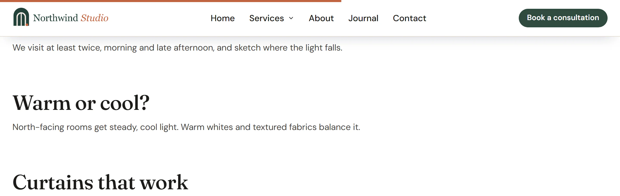
Add a Reading Progress bar
Open your blog post template in the Theme Builder. Then open Insert in the left panel, find Reading Progress in the Site & theme group (or type "progress" in the search box) and drag it anywhere into the template. See Add elements.
With Position set to Top of the screen or Bottom of the screen, the bar is fixed to that edge wherever you drop the widget. In the editor, it is shown where it sits in the layout, a third full, so it does not cover the canvas.
Choose what it measures
- The post content measures the article itself (the Post Content widget), so the bar is full when the reader reaches the end of the text, not the footer. When there is no post content on the page, it measures the whole page.
- The whole page measures from the top to the bottom of the page.
- An element by CSS ID measures one section. Give that section an Anchor ID in Behaviour → Anchor & classes and type it in CSS ID, without the #.
Content tab settings
| Setting | What it does |
|---|---|
| Position | Top of the screen, Bottom of the screen or Where the widget is. Default: Top of the screen. |
| Measure | The post content (falls back to the page), The whole page or An element by CSS ID. Default: The post content. |
| CSS ID | The Anchor ID of the section to measure, without #. Shown for An element by CSS ID. |
Design tab settings
| Section | Settings |
|---|---|
| Bar | Height, Bar color, Track color (the empty part), Distance from the edge (room for a sticky header, for example; not for Where the widget is), Rounded end. |
The Design tab also has the sections every element shares: Spacing & position, Background & border and Mask. See Spacing, size & position.
Behaviour tab
The Behaviour tab has the settings every element shares: anchor and classes, entrance animations, motion effects, visibility per device, display conditions and interactions. See Visibility.
Tips
- The bar is decorative, so screen readers skip it.
- If your header is sticky, you can put the bar right under it with Distance from the edge, or at the very top above it.