Responsive editing
Design for desktop, tablet and mobile with device views, per-device values and canvas widths.
On this page
Your pages adapt to every screen size. You design the desktop version first, then switch to Tablet or Mobile and change only what needs to be different there, such as a smaller heading or columns that stack.
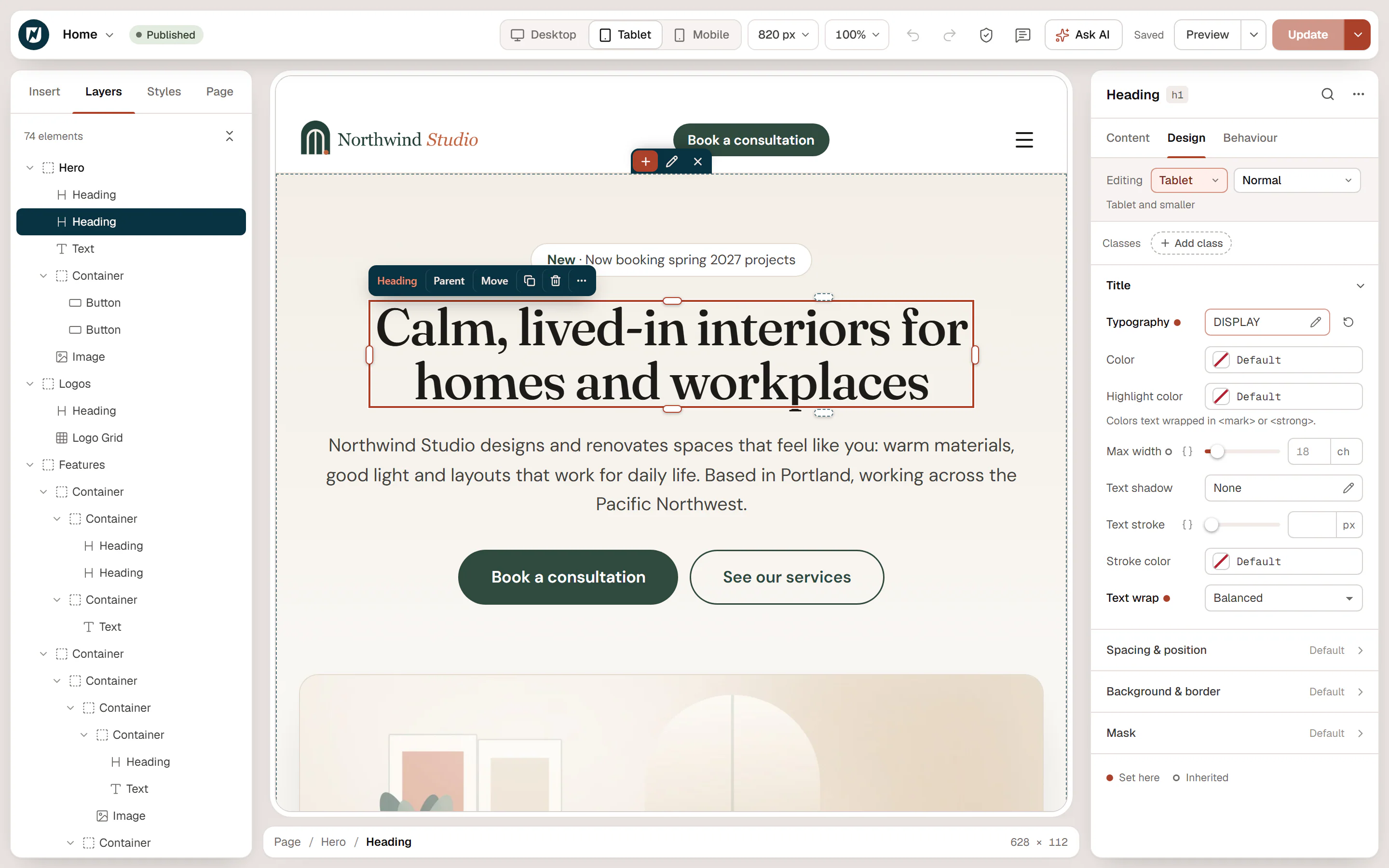
Devices and screen sizes
| Device | Screen width | Values you set here apply to |
|---|---|---|
| Desktop | wider than 1024 px | every screen, unless a smaller device has its own value |
| Tablet | up to 1024 px | tablets and phones |
| Mobile | up to 767 px | phones |
This is called desktop-first: a value flows down from Desktop to Tablet to Mobile until a device sets its own. Sites imported from Elementor can bring extra devices, such as Laptop or Widescreen; they work the same way.
Switch the device
Click Desktop, Tablet or Mobile in the top bar, or pick the device in the Editing row at the top of the inspector's Design and Behaviour tabs. The canvas resizes (Tablet shows 820 px wide, Mobile 390 px) and the selected element stays in view.
The device you view is also the device you edit. The inspector reminds you with a hint under the Editing row: applies to all widths on Desktop, Tablet and smaller on Tablet, Mobile and smaller on Mobile.
Change a value for one device
Design the desktop version
Set up the element on Desktop first. These values are the base for every device.
Switch to the smaller device
Click Tablet or Mobile in the top bar.
Change the setting
Change only what should be different, for example the font size or the direction of a row. The value is saved for this device and smaller ones. The desktop version stays as it was.
The dot next to a setting's label shows where the value comes from:
- Filled dot: set on this device. Click it to remove the device value; the setting then follows the larger device again.
- Hollow dot: inherited. Hover it to see from which device, for example Inherited from Desktop.
In the typography, border and similar pop-up editors, fields that can differ per device show a small tablet or phone icon while you edit a smaller device.
Common responsive tasks
- Stack columns on phones: select the row container, switch to Mobile and set Direction to column (in the Content tab, under Layout). Layouts added from Add section already do this. See Containers & flexbox.
- Fewer grid columns: select the grid, switch to Tablet or Mobile and lower Columns. See Grid.
- Smaller headings: text styles from the Design System already have tablet and mobile sizes. To change one element only, switch device and change Size in its typography settings.
- Less padding: switch device and change Padding under Spacing & position. See Spacing, size & position.
- Hide an element on one device: turn on Hide on desktop, Hide on tablet or Hide on mobile in Behaviour → Visibility. See Visibility.
Some effects have their own device switch: Sticky on for sticky elements, Apply on for scroll and mouse effects, and Runs on for animations. See Motion & effects.
Check other screen sizes
Use the Canvas width menu in the top bar to see the page at a specific width, for example 1440 px · desktop or 360 px · mobile. Picking a width also switches to the matching device. Fit to window goes back to the normal view. See Top bar.
The editor shows the page closely, but always check the result on a real phone before you launch: open the page with Preview in new tab and use your browser's device mode, or open it on your phone.