Table
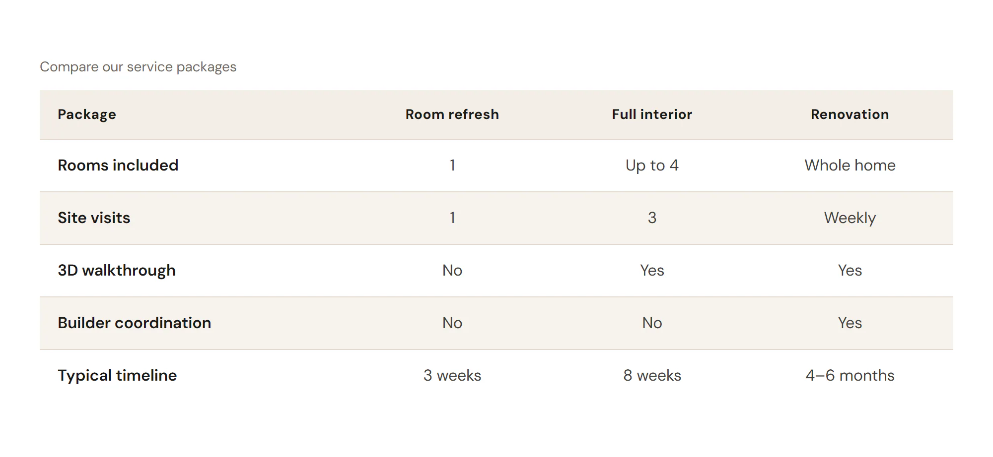
A data or comparison table with a caption, striped rows and a sticky header, readable on phones.
On this page
The Table widget shows information in rows and columns, such as a comparison of packages, opening hours or technical details. You define the columns once, then add rows with one cell per line. The table can have striped rows, a sticky header and a caption, and it scrolls sideways or turns into cards on small screens.
Add a Table
Open Insert in the left panel and find Table in the Content group, or type "table" in the search box. Drag it onto the canvas, or click it to add it next to the selected element. See Add elements.
Set up columns and rows
Define the columns
Under Columns, add one item per column. Type its Header, and optionally set its Alignment and Width.
Add the rows
Under Rows, add one item per row. In Cells, type one cell per line, in the same order as the columns. Leave a line empty for an empty cell. Bold, italic and links are allowed.
Add a caption
Type a short Caption, such as "Compare our service packages". It names the table for screen readers too. Turn off Show caption to keep it for screen readers only.
With First column is a header on, the first cell of each row is marked as that row's header. Screen readers then announce, for example, "Site visits, Full interior, 3".
To draw attention to one row, open it and turn on Highlight row.
Content tab settings
| Setting | What it does |
|---|---|
| Columns | The list of columns, from left to right. |
| Header (each item) | The column title. |
| Alignment (each item) | Left, Center or Right for the whole column. Default: Left. |
| Width (each item) | An optional column width. |
| Show header row | Shows the row of column titles. On by default. |
| Setting | What it does |
|---|---|
| Rows | The list of rows. |
| Cells (each item) | One cell per line, in column order. Inline formatting and links are allowed. |
| Highlight row (each item) | Gives the row the highlight color. Off by default. |
| First column is a header | Marks the first cell of each row as its row header for screen readers. On by default. |
| Caption | A short title for the table, also used as its name for screen readers. Supports dynamic data. |
| Show caption | Shows the caption on the page. On by default. Shown when there is a caption. |
| Caption position | Top or Bottom. Default: Top. Shown when there is a caption. |
| Setting | What it does |
|---|---|
| Striped rows | Alternates the row background. On by default. |
| Borders | Between rows, All cells, Outer frame only or None. Default: Between rows. |
| Highlight row on hover | Colors the row under the pointer. On by default. |
| Sticky header | The table scrolls inside its own area and the header row stays visible. Off by default. |
| Max height | The height of that scroll area. Can differ per device. Shown when Sticky header is on. |
| On phones | Scroll horizontally or Stack rows as cards (each row becomes a card with the column names as labels). Default: Scroll horizontally. |
| Table min width | Below this width the table scrolls sideways. Can differ per device. |
Design tab settings
| Section | Settings |
|---|---|
| Table | Typography, Text color, Background, Border color, Border width, Border radius, Cell padding, Vertical alignment (Middle, Top or Bottom), Stripe color, Hover row color, Highlighted row color. |
| Header row | Typography, Text color, Background. Shown when the header row is on. |
| First column | Typography, Text color. Shown when the first column is a header. |
| Caption | Typography, Color, Alignment, Spacing. Shown when there is a caption. |
The Design tab also has the sections every element shares: Spacing & position, Background & border and Mask. See Spacing, size & position.
Behaviour tab
The Behaviour tab has the settings every element shares: anchor and classes, entrance animations, motion effects, visibility per device, display conditions and interactions. See Visibility.
Tips
- Check the table in the Mobile view. For tables with many columns, Stack rows as cards is often easier to read than scrolling.
- Keep cells short: a word, a number or "Yes"/"No". Put longer explanations in the text around the table.